Can You Tell a Shakespeare Play By Its Poster?

Graphic by Angelie Zaslavsky
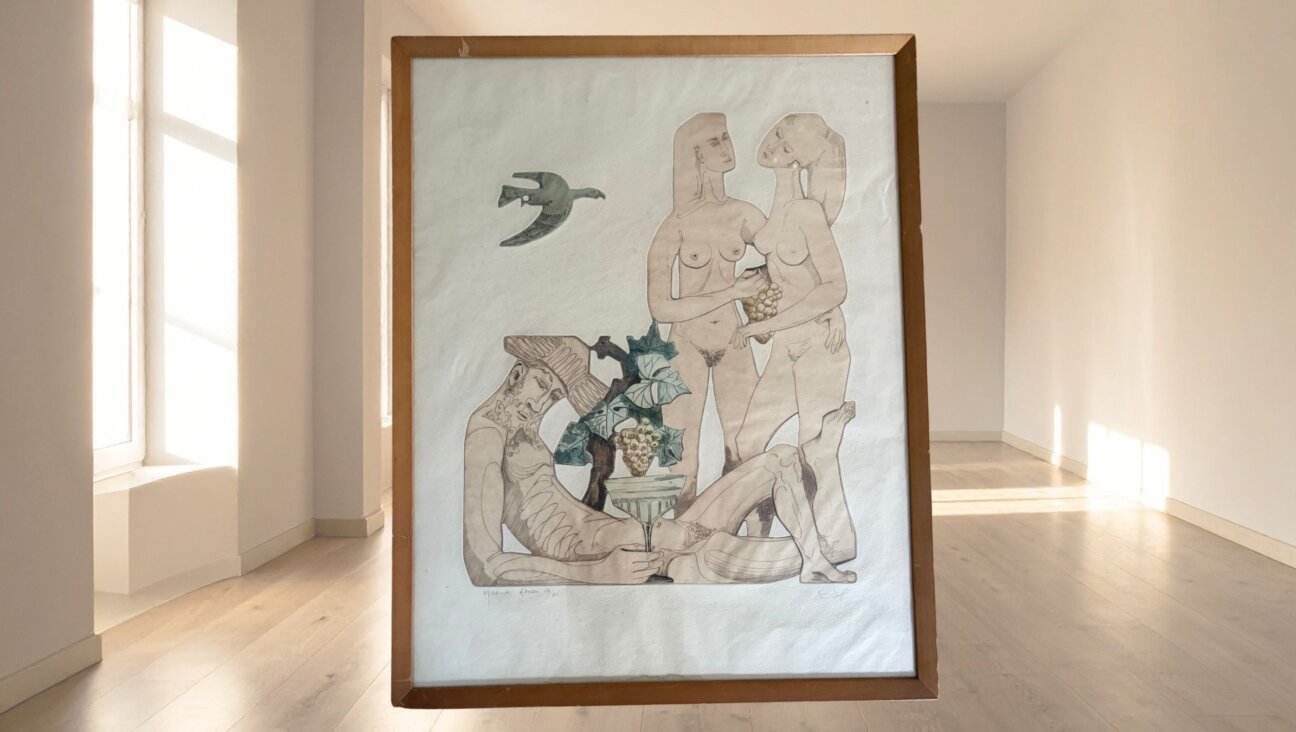
Against a red background, a featureless white head, lacking its crown, opens to reveal a set of white steps descending into a black cavern. A man in profile, the barest combination of ivory skin and black robe, stares down into the almost pleading sockets of a skull in his hands. A shining, simple crown hovers like a spaceship over a barren plain, a dark storm sweeping over the land behind it.

Image by Presenting Shakespeare
Those are three of more than 100 posters for “Hamlet” included in Mirko Ilić and Steven Heller’s recent book “Presenting Shakespeare,” the first published collection of posters for the Bard’s plays. Paging through the section on “Hamlet,” the first and longest in the book, it’s difficult not to gasp. The contents are elusive, agonized and surprisingly gory. (The latter is especially true of Ilić’s contribution, for Hungary’s Teatar & TD 1981 production, which features a phallus-nosed Hamlet holding his own heart on a sword, lungs and intestines cascading out of his rent body. When I asked its originator about the relationship between design and beauty, he shrugged and gave the Keatsian response that “Truth is pretty.”
“Good design, especially poster, is supposed to stop you in a second,” Ilić said. “And when you stop you are supposed to discover a little bit more.”
We were speaking at the offices of his design firm, Mirko Ilić Corp., located in a quiet corridor of Manhattan’s Midtown East. Ilić, who was born in Bosnia but calls Croatia’s Zagreb his hometown, has amused blue eyes and close-cropped dark gray hair. Wearing a black cord necklace and a set of silver rings, he gave off an aura of cool intensity offset by a sense of delightedly deadpan humor.
He and Heller, formerly the art director of The New York Times Book Review, are longtime collaborators. They met shortly after Ilić moved to the United States in 1986.
“I showed him my portfolio,” Ilić said, “and that’s how I got my first published illustration in the United States,” which was an illustration of Allen Joseph’s May 1986 review of Andrew Harvey’s “Burning Houses” for The New York Times Book Review.
Their previous shared work ranges from Ilić’s design for Heller’s book “The Swastika: Symbol Beyond Redemption?” to several books on the history and purpose of design. Shakespeare was a different sort of territory, accessed almost accidentally. “I look for different things constantly,” Ilić said, “I was looking for some posters for Shakespeare movies for a particular German artist from the ’30s, and then I, to my astonishment, find out there is no one single book ever published in [the] whole world about posters for Shakespeare plays.”

Image by Courtesy of Presenting Shakespeare
That inspiration to fill that void struck a year and a half ago; the aligning of the resulting book’s completion with the much-heralded 400th anniversary of Shakespeare’s death was a happy coincidence. When Heller and Ilić work together, Ilić takes charge of design — choosing and organizing the images — and Heller writes the text, which in “Presenting Shakespeare” is fairly minimal. The posters, from professional companies, universities and even high schools across the globe — and some, yes, from Shakespeare’s Globe — are, primarily, allowed to speak for themselves.
Not accidentally, they do so with varying success. While Ilić and Heller were selective about the book’s contents, including only 1,099 of the 2,000-odd posters they found during their research, they decided that the book needed to serve, in part, as a catalog for other designers, as well as the public, to reference. (The book’s cover touts 1,100, but Ilić, who was determined to include only posters for theatrical productions, withdrew a poster last-minute when he learned it had been, in fact, for an opera.)
“This book now cannot be best of the Shakespeare posters,” Ilić said wryly, “because we never saw what is the rest.”

Hamlet Image by Presenting Shakespeare
The most affecting inclusions are invariably the most surprising. Standing out in a sea of posters for “Romeo and Juliet” featuring moody, intertwined lovers or vivid broken hearts, a 2007 poster from Germany’s Strassentheater features the red silhouettes of two pairs of feet on a white background, the outer set facing upward, the inner down. A tag reading “Juliet” dangles from one of the outer pair’s toes, as does one reading “Romeo” from the inner’s. They are, of course, the tags attached to the corpses of two people making love; beyond the arresting visual cleverness, the poster encapsulates both the play’s grimness and its joy.
At a March event promoting “Presenting Shakespeare” at Brooklyn’s Theatre for a New Audience, the director and designer Julie Taymor gave voice to the feeling of intrigue and excitement provoked by posters like that from the Strassentheater.

Poster for ‘A Midsummer Night’s Dream’ at Theater for a New Audience. Image by Presenting Shakespeare
Posters are “an ideograph,” she said, “the one stroke. The poster artist has to get to the pure version of what the play is about.”
Posters, added Jeffrey Horowitz, founding artistic director of Theatre for a New Audience, create “feeling before seeing.” Taymor’s poster for the theater’s 1994 production of “Titus Andronicus,” projected behind him, was a good illustration of his point; when it first appeared in the evening’s slideshow, a scratched, black-and-white photograph of a wild-eyed dog standing over a prone human baby, parts of the audience gave a quick shiver of revulsion.
For the best-represented plays in the book — which tend to be tragedies — the posters included elicit a striking variety of feelings. “It’s amazing that people can read same play, stare [at the] same thing, same symbol, and produce something totally different,” Ilić said. “People project using Shakespeare. That is why there are totally different interpretations.”
For certain of Shakespeare’s more politically questionable plays, that variation of interpretation is especially striking. For “The Merchant of Venice,” some inclusions lean clearly toward the anti-Semitic — the first in the section, from Puerto Rico in 1964, is a print of a man of stereotypical Jewish appearance brandishing a knife with apparent glee – while others shy away from that dangerous territory, instead building up the play’s themes of love and justice. Most interestingly, a 2012 poster from the Habima National Theatre of Israel in partnership with the Globe Theatre shows an elderly man holding a set of empty scales, his demeanor composed but his eyes seized by sadness. It’s a good reminder that Shylock, like the other great Shakespearean antiheroes — Macbeth, Othello, Brutus — is a man beaten down by experience, that his villainy did not arise in a vacuum.
Ilić described himself and Heller as “kind of bleeding heart liberals,” but with sensitive subject matter like that of “Merchant of Venice” they were careful to include posters that depicted a range of political leanings. That choice benefits the book, providing another measure by which the variety of art included lets its audience reach a deeper understanding of Shakespeare’s global meaning.
“Being pro-communist in United States is dissent,” Ilić said. “If something is really well-designed, and it’s not insulting, why not?”
For Ilić, the range of work he and Heller included in the book serves not only as a stimulant for thought and creativity, but also as proof of Shakespeare’s genius. “It’s kind of [a] symbol of good art,” he said. “For everybody it’s something else.”
Talya Zax is the Forward’s culture intern. Contact her at [email protected] or on Twitter, @TalyaZax
It’s our birthday and we’re still celebrating!
We hope you appreciated this article. Before you go, we’d like to ask you to please support the Forward’s independent Jewish news.
This week we celebrate 129 years of the Forward. We’re proud of our origins as a Yiddish print publication serving Jewish immigrants. And we’re just as proud of what we’ve become today: A trusted source of Jewish news and opinion, available digitally to anyone in the world without paywalls or subscriptions.
We’ve helped five generations of American Jews make sense of the news and the world around them — and we aren’t slowing down any time soon.
As a nonprofit newsroom, reader donations make it possible for us to do this work. Support independent, agenda-free Jewish journalism and our board will match your gift in honor of our birthday!


