


66 Years of Israeli Voting in 1 Cool Graphic


Gal Beckerman March 16, 2015
If you want to see in one shot why many Israel observers are tearing their hair out in response to the country’s electoral process, feast your eyes on this cool infographic from the Economist.
The chart shows the breakdown of each election since 1949 until the projected results of tomorrow’s vote. At the top are election years dominated by the mega party of Mapai, and after 1973 by Labor and Likud, each taking equally large chunks. But by the mid-1990s we begin to see the situation that has led today to a feeling of paralysis — lots of smaller parties each biting off sizable fractions out of the total of 120 seats, but no one winning more than 30.
If there’s a case to be made for electoral reform, this pretty much captures it.

The Forward is free to read, but it isn’t free to produce

I hope you appreciated this article. Before you go, I’d like to ask you to please support the Forward.
Now more than ever, American Jews need independent news they can trust, with reporting driven by truth, not ideology. We serve you, not any ideological agenda.
At a time when other newsrooms are closing or cutting back, the Forward has removed its paywall and invested additional resources to report on the ground from Israel and around the U.S. on the impact of the war, rising antisemitism and polarized discourse.
This is a great time to support independent Jewish journalism you rely on. Make a gift today!
— Rachel Fishman Feddersen, Publisher and CEO
Support our mission to tell the Jewish story fully and fairly.


Most Popular
- 1

Fast Forward Ye debuts ‘Heil Hitler’ music video that includes a sample of a Hitler speech
- 2

Opinion It looks like Israel totally underestimated Trump
- 3

Culture Is Pope Leo Jewish? Ask his distant cousins — like me
- 4

Fast Forward Student suspended for ‘F— the Jews’ video defends himself on antisemitic podcast
In Case You Missed It
-
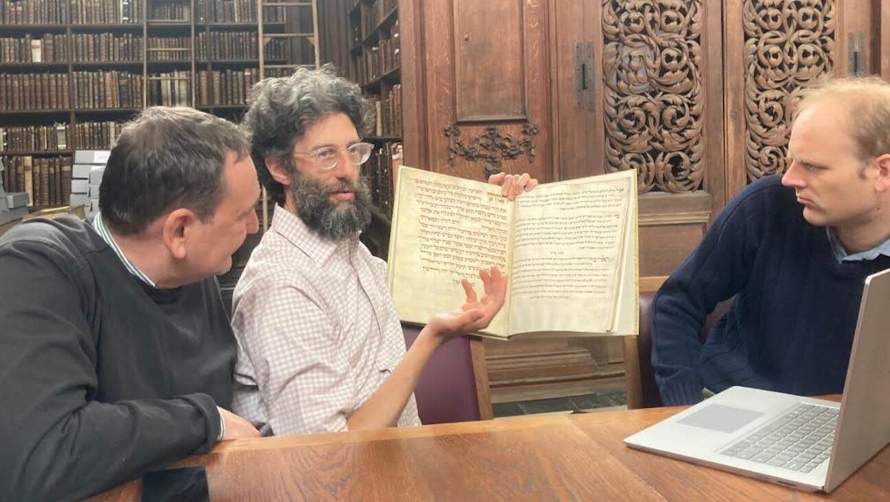
Fast Forward For the first time since Henry VIII created the role, a Jew will helm Hebrew studies at Cambridge
-

Fast Forward Argentine Supreme Court discovers over 80 boxes of forgotten Nazi documents
-

News In Edan Alexander’s hometown in New Jersey, months of fear and anguish give way to joy and relief
-

Fast Forward What’s next for suspended student who posted ‘F— the Jews’ video? An alt-right media tour
-
Shop the Forward Store
100% of profits support our journalism


Republish This Story
Please read before republishing
We’re happy to make this story available to republish for free, unless it originated with JTA, Haaretz or another publication (as indicated on the article) and as long as you follow our guidelines.
You must comply with the following:
- Credit the Forward
- Retain our pixel
- Preserve our canonical link in Google search
- Add a noindex tag in Google search
See our full guidelines for more information, and this guide for detail about canonical URLs.
To republish, copy the HTML by clicking on the yellow button to the right; it includes our tracking pixel, all paragraph styles and hyperlinks, the author byline and credit to the Forward. It does not include images; to avoid copyright violations, you must add them manually, following our guidelines. Please email us at [email protected], subject line “republish,” with any questions or to let us know what stories you’re picking up.