Why Time’s Trump Cover Is A Subversive Work of Political Art — Even A Year Later

Graphic by Angelie Zaslavsky
Time Magazine put Donald Trump on its cover last year. The Forward’s Jake Romm called the cover shot a covert act of political subversion. It became the most-read article in the history of our digital publication. A year later, his analysis rings even truer than ever.
Time Magazine’s annual “Person of the Year” announcement is, year after year, grossly misunderstood. Time Magazine is clear on its sole criterion – “the person who had the greatest influence, for better or worse, on the events of the year” – yet, do a simple search on Twitter and you will find countless people who seem to think that the “Person of the Year” selection is tantamount to an endorsement. Previous winners have included Joseph Stalin (1939, 1942), Ayatollah Khomeini (1979), Adolf Hitler (1938), and other figures who I think it is safe to assume the Time staff does not endorse.
This year, it should come as no surprise that President-elect Donald Trump was chosen to grace the cover of Time’s annual issue (shot by Jewish photographer Nadav Kander). “For better or worse,” Trump, during his campaign and now after his election, has certainly been among the greatest influences on the events of the year. For clues as to how Time feels about that question — is it “for better or worse?” — we can look to the image chosen for the cover of the issue. The decisions that Time made regarding how to photograph Trump reveal a layered, nuanced field of references that place the image among, in this viewer’s opinion, the magazine’s greatest covers.
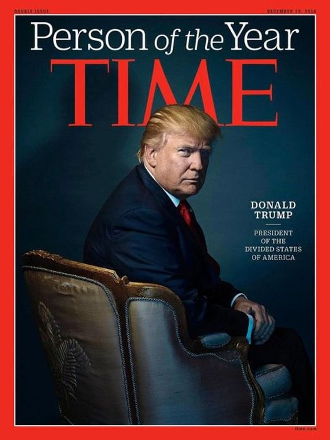
Image by Nadav Kander / Time Magazine
In order to deconstruct the image, let’s focus on three key elements (leaving aside the placement of the ‘M’ in ‘Time’ that makes it look like Trump has red horns): the color, the pose, and the chair:
The Color
Notice how the colors appear slightly washed out, slightly muted, soft. The palette creates what we might call a vintage effect. The image’s sharpness and detail reveal the contemporaneity of the picture, but the color suggests an older type of film, namely, Kodachrome. Kodachrome, the recently discontinued film produced by Kodak, was designed to create accurate color reproduction in the early 1900’s. It was immensely popular between the late 30’s and 70s, and its distinctive look defines our common visual concept of nostalgia.
By reproducing a Kodachrome color palette, the Time cover makes us reimagine the cover as if it were an image from the era of Kodachrome’s mass popularity. (Where your mind goes when thinking about leaders from the era of World War Two, segregation, and the Cold War era is up to you.) This visual-temporal shift in a sense mirrors a lot of the drives that fueled Trump’s rise. Trump ran a campaign based on regressive policies and attitudes — anti-environmental protection, anti-abortion, pro-coal, etc. This election was not just about regressive policy choices, but also about traditional values (defined primarily by the Christian right), about nostalgia for American greatness and security, about nostalgia for a pre-globalized world.
The Pose
Trump’s pose can be read as a subversive play on a traditional power-portrait pose (look to Delaroche’s portrait of a defeated Napoleon for another wonderfully subversive take on the pose, though the tone there is elegiac as opposed to scheming).

Napoleon I At Fontainebleau, 31 March, 1814 - Paul Delaroche Image by © Le Gall 1990 / Reproduction rights: Musée de l'Armée - Paris
Paintings of seated monarchs can be seen to hold two aesthetic functions — to ground the association between the sitter and the throne, thus solidifying the metonymy, and to heighten the sense of servitude in the viewer. The viewer must approach the monarch, the monarch does not rise for the viewer.
In our post-monarchic time, the power of the throne is largely gone, but the power of a seated figure remains. The chair itself is unimportant, it is the act of sitting that matters. By placing a portrait in this tradition, the chair assumes the role of the throne, and the sitter the role of king (or queen) — the visual effect is the same.
Consider the following image of the Lincoln Memorial (for further reference, view these images of Vladimir Putin and LL Cool J:

Image by Mark Wilson / Getty Images
The image of the Lincoln Memorial (and the other two images) is an exaggerated version of the traditional pose. We see our subject head on, but, most importantly, we see the subject from below. The angle forces us to look up at the subject, which in turn creates the impression that the subject is looking down at us. This pose and angle, with the viewer seemingly (and literally in the case of the Lincoln Memorial), at the subject’s feet, makes the subject appear dominant, powerful, judging.
But, flip the image around, and suddenly we have a whole new set of connotations. On the Time cover, instead of seeing Trump head on and from below, we see him seated from behind and roughly at eye level. The power relation has shifted entirely.
Trump’s turn towards the camera renders the tone conspiratorial rather than judgmental. There are two images at play here — the imagined power-image taken from the front, and the actual image, in which Trump seems to offer the viewer a conniving wink, as if to say, look at how we hoodwinked those suckers in the front (both Trump and the viewer are looking down on those in front). By subverting the typical power dynamic, Time, in a sense, implicates the viewer in Trump’s election, in his being on the cover in the first place.
In another layer, much of what we know about Donald Trump has been gleaned through images. He is a master of branding, a reality TV star who has long been a tabloid favorite. By choosing not to shoot Trump head on, the Time cover almost offers us a “behind the scenes” glimpse of the man who has spent so much of his time in front of the camera – heightening the conspiratorial tone and complicity of the viewer. The highly posed and processed nature of the photograph offers yet another level of irony.
Finally, we must note the ominous shadow lurking on the backdrop. It’s a small, but important and clever detail. Just as this image provides us with two theoretical points of view, it also provides us with two Trumps — Trump the president-elect, and the specter of Trump the president, haunting in the wings, waiting to take form.
The Chair

Image by Nadav Kander / Time Magazine
The masterstroke, the single detail that completes the entire image, is the chair. Trump is seated in what looks to be a vintage “Louis XV” chair (so named because it was designed in France under the reign of King Louis XV in the mid 18th century). The chair not only suggests the blindly ostentatious reigns of the French kings just before the revolution, but also, more specifically, the reign of Louis XV who, according to historian Norman Davies, “paid more attention to hunting women and stags than to governing the country” and whose reign was marked by “debilitating stagnation,” “recurrent wars,” and “perpetual financial crisis” (sound familiar?).
The brilliance of the chair however, is visual rather than historical. It’s a gaudy symbol of wealth and status, but if you look at the top right corner, you can see a rip in the upholstery, signifying Trump’s own cracked image. Behind the bluster, behind the glowing displays of wealth, behind the glittering promises, we have the debt, the tastelessness, the demagoguery, the racism, the lack of government experience or knowledge (all of which we unfortunately know too well already). Once we notice the rip, the splotches on the wood come into focus, the cracks in Trump’s makeup, the thinness of his hair, the stain on the bottom left corner of the seat — the entire illusion of grandeur begins to collapse. The cover is less an image of a man in power than the freeze frame of a leader, and his country, in a state of decay. The ghostly shadow works overtime here — suggesting a splendor that has already passed, if it ever existed at all.
—

Image by Time Magazine
Taken together, these elements add up to a profound portrayal of anxiety for the coming years. We have the implicit placement of Trump in the mid 1900’s (looking through the Time Magazine cover archives, no images really resemble this cover, save the one seen on the left [a purely visual comparison]). We have a suggestion of the scheming, sordid underside of power. We have the crumbling facade of wealth, which, like “The Picture of Dorian Gray” suggests more than just a physical deterioration.
As a photograph, it’s a rare achievement. As a cover, it’s a statement.
Jake Romm is the Forward’s culture intern. Contact him at [email protected] or on Twitter, @JakeRomm
This is a moment of great uncertainty. Here’s what you can do about it.
We hope you appreciated this article. Before you go, we’d like to ask you to please support the Forward’s independent Jewish news this Passover. All donations are being matched by the Forward Board - up to $100,000.
This is a moment of great uncertainty for the news media, for the Jewish people, and for our sacred democracy. It is a time of confusion and declining trust in public institutions. An era in which we need humans to report facts, conduct investigations that hold power to account, tell stories that matter and share honest discourse on all that divides us.
With no paywall or subscriptions, the Forward is entirely supported by readers like you. Every dollar you give this Passover is invested in the future of the Forward — and telling the American Jewish story fully and fairly.
The Forward doesn’t rely on funding from institutions like governments or your local Jewish federation. There are thousands of readers like you who give us $18 or $36 or $100 each month or year.

