How women helped to transform the world of books and print
The art of Lynne Avadenka celebrates women who worked with (and against) type
Graphic by Angelie Zaslavsky
Lynne Avadenka is a Detroit-based Jewish artist with a particular fascination for books and printing. In The Work of Her Hands, a new exhibit at the Jewish Theological Seminary, she explores text and image, the physical and philosophical idea of the book, and the mystery and beauty of visual language.
Dan Friedman spoke to Avadenka at the exhibit launch and then continued the conversation by email. Their exchanges have been edited for length and clarity.
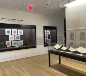
There are six rare books on display in the middle of your art exhibit, from Constantinople, Lviv, Amsterdam, Vilna and others. Can you tell me how they were chosen and why they are meaningful to you?
All six are books from the 16th to the 19th centuries that I “discovered” had been printed by Jewish women while researching a different project. It’s only because their names are printed in the books — that is, only because some of these women set their very own names in type in the books — that we know who they are. When I began the artistic part of this project, I mentioned it to [JTS Library curator Sharon Liberman Mintz], and we realized we had an exhibition because, as she told me, “Some of these books — with women’s contributions as printers, correctors, publishers, are in the JTS Library.”
As well as those women printers, you have some “Female Forme” artworks on display recognizing other important Jewish women in books. How does that series work?
The title of this series is a play on words, as the word “forme” is the old English way of spelling “form,” an arrangement of type, locked together, ready to be printed. The women printers are named and starting from the right are presented chronologically. Using the word “forme” is a pretty obscure reference, I will admit, but I liked the wordplay. This series includes, in large red Hebrew type, the names of 12 Jewish women involved in the Hebrew printed book world. The small red type printed on each page in a circle is a verse from the Eshet Chayil prayer: “She works willingly with her hands.” That same phrase is repeated in large Hebrew wood type that runs along the bottom of the entire series in Hebrew and is actually three words: “v’ta’as b’chefetz capeha.”
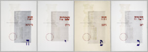
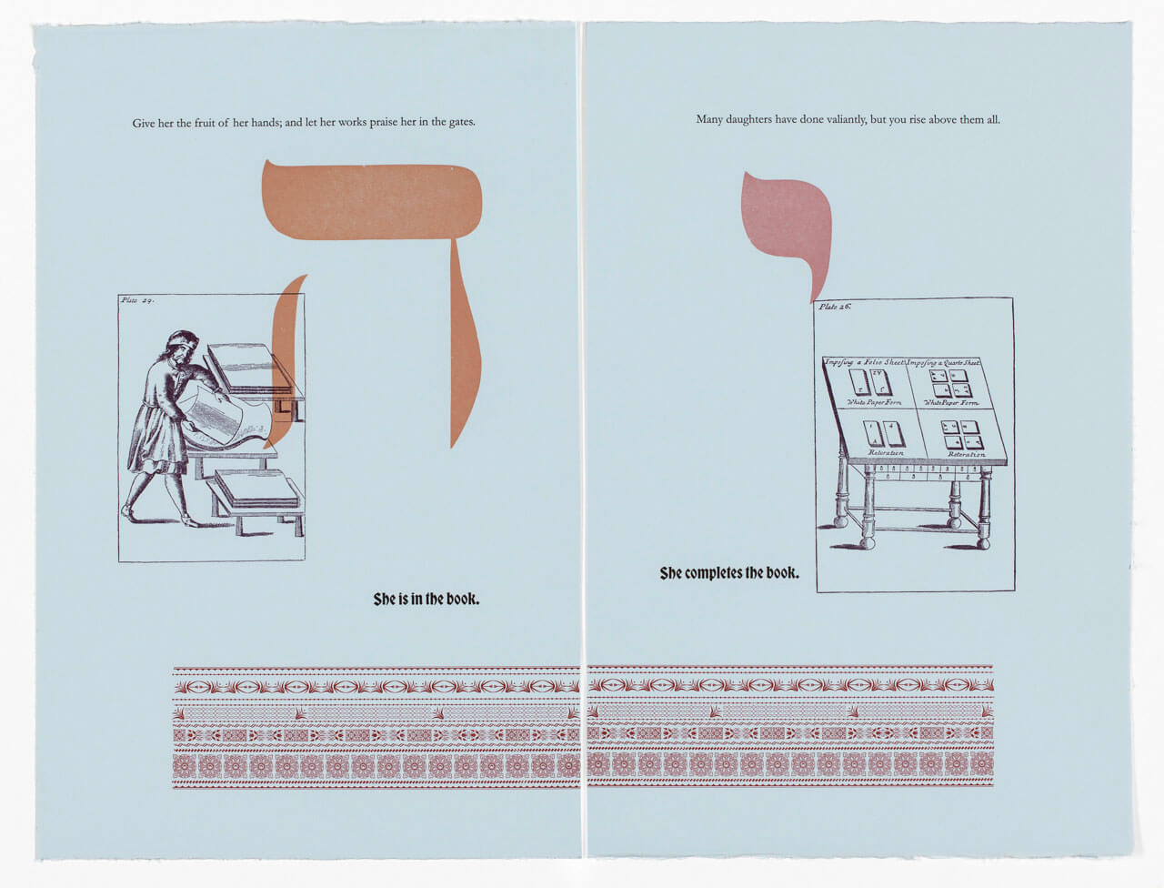
As you mentioned earlier, women’s historical involvement in the production of books has been almost totally overlooked. “Handy-Works” isn’t about specific women, per se, but each piece has five elements: a top quote in English from Proverbs 31 — better known to Jews as the Eshet Chayil prayer, a large Hebrew letter floating on or over the rest, a picture plate, a bold Gothic statement in English like “she is on her own,” and a pattern. Can you tell us more about the elements and why you bring them together?
In this suite of prints, I selected 12 verses from Proverbs 31: 10-31, which extol a “woman of valor” and juxtaposed these 12 verses against 12 of my own short sentences that tell the story of a hypothetical Jewish woman, who is, suddenly, by circumstance, pushed into the art and commerce of printing. The title is a play on Joseph Moxon’s book “Mechanick Exercises: or The Doctrine of Handy-Works,” printed in London in 1683. The second volume of this book included a treatise on the craft of printing entitled “Mechanick Exercises on the Whole Art of Printing,” and my images are made from the plates in that volume. The Hebrew letters, printed from wood type, read: “v’ta’as b’chefetz capeha,” again.
The patterns running along the bottom were printed from small pieces of decorative metal type and are meant to evoke the elaborate Italian textiles from the 15th century. Machined textiles began to be manufactured at the same time as the first printed books but were always more intuitively associated with women, so they made sense historically and aesthetically to me.
The selected verses from Eshet Chayil make clear the extraordinary efforts of the Jewish woman to keep a family together — she is doing everything. The short sentences I wrote specifically laud the efforts of Jewish women accepting the responsibility of continuing a family business, which happens to be printing, which is why we know their names.
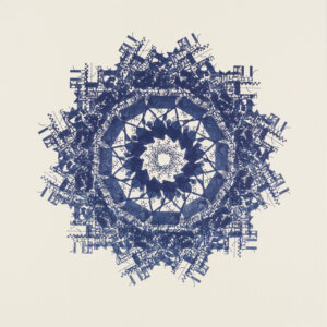
The final series represented in the show is a series you call “Inventions,” which resemble Hebrew letter mandalas. The video that is looping on an iPad fixed next to the installation shows you hand-printing and reprinting the paper stock 24 times to get the spiral effect. On the face of it, these are less explicitly concerned with women and books, though of course the video is literally of a Jewish woman printing. What were you trying to achieve in this series?
In 1592, the polymath Jewish scholar David Gans published a text in his book “Zemah David” to celebrate the value of the art and craft of print. He called it a “great invention,” and compared movable type and printing to other amazing innovations of the time. My prints incorporate that phrase, along with other phrases found in the colophons of early Hebrew printed books. In the first Hebrew books published in the late 15th century, when there was still no word for the act of printing, composition like this – composed without a scribe – was described as writing “by many pens without miracles” (“hakotev b’kama culmusim bli nisim”).
A line at the end of one Hebrew book published in Mantua in 1476 poetically describes the process of printing: “In a moment ink flows over me [the letters], without guidelines, the ‘writing’ is even.” As with all my work, I aim to create a beautiful image that is conceptually meaningful. We look at Japanese, Chinese and Islamic letterforms and find them beautiful, even if they can’t be “read.” I am doing that with Hebrew letters.
It’s our birthday and we’re still celebrating!
We hope you appreciated this article. Before you go, we’d like to ask you to please support the Forward’s independent Jewish news.
This week we celebrate 129 years of the Forward. We’re proud of our origins as a Yiddish print publication serving Jewish immigrants. And we’re just as proud of what we’ve become today: A trusted source of Jewish news and opinion, available digitally to anyone in the world without paywalls or subscriptions.
We’ve helped five generations of American Jews make sense of the news and the world around them — and we aren’t slowing down any time soon.
As a nonprofit newsroom, reader donations make it possible for us to do this work. Support independent, agenda-free Jewish journalism and our board will match your gift in honor of our birthday!


