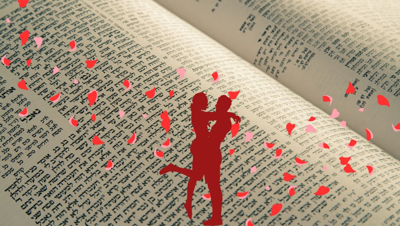
Q & A: A Hebrew typographer on reading between a prayer book’s lines

Graphic by Angelie Zaslavsky

By Irene Katz Connelly July 23, 2020
In the alternate pandemic reality of my daydreams, I don’t spend my afterwork hours sanitizing groceries and watching more TV than ever before. Rather, I’m raising chickens outside my charming farmhouse, harvesting my own produce and cancelling my streaming subscriptions to focus on projects of personal and societal improvement.
No one is actually living like this during quarantine, I’ve always consoled myself. Unfortunately, now I know that someone actually is: typographer and book designer Scott-Martin Kosofsky, who answered my call from the actual farm in Rhinebeck, N.Y. where he’s passed the coronavirus pandemic, keeping not just chickens but also llamas and alpacas — and using the prolonged period of time at home to scratch an old creative itch.

Kosofsky at home with companion Piper. Image by Scott-Martin Kosofsky
A long-time font aficionado who learned letterpress printing as a teenager, Kosofsky turned his hobby into a career, founding book design firm The Philidor Company and producing books on subjects from the history of the Roman capital letter to the use of Helvetica in the New York City subway system. But since his first Judaica project — a 1990s Shabbat songbook for Harvard Hillel — he’s specialized in Hebrew books and Hebrew type. Through the pandemic, he’s been busier than ever, helping synagogues prepare for high holidays at home by converting hardcover prayer books into paperback editions that can be delivered to congregants’ homes.
But since the coronavirus’s onset, he’s also fulfilled a longstanding ambition: converting a little-known Hebrew typeface dating from the 16th century to a digital font ready for use in modern prayer books and Hebrew books.
For years, Kosofsky had been fascinated with the masterful work originating from the Prague printing house of Gershom ben Solomon haKohen, a Jewish publisher known for creating types based on the handwritten Ashkenazi manuscripts of Western and Central Europe. His passion project is part of a larger quest to revive Ashkenazi fonts, the edgy, gothic cousins to the sleek Sephardic styles that have historically dominated Hebrew printing and are prevalent in Israel today.
Kosofsky took a break from tending his alpacas to speak with me about what it takes to convert a historic font and why it’s important that modern Judaic books nod to our storied typographic history. The following conversation has been edited for length and clarity.
Irene Katz Connelly: What was it about a global pandemic that made you want to dive into a time-intensive typesetting project?
Scott-Martin Kosofsky: It was a compulsion. I’ve been thinking about this type for several years. When the virus came and everyone was shut in, I lost track of what was Monday, Tuesday, Wednesday, like we all did. But then I thought, “What if I get sick and die, and I wouldn’t be able to make these types?” So I started in early April and I went crazy working on them. I thought they were important.

A page from Kosofsky’s updated High Holiday prayer book for New York City’s Central Synagogue, which shows essential workers biking past the empty temple. Image by Scott-Martin Kosofsky
Typography isn’t exactly a typical career path. How did you wind up here?
My father was a business writer, and while I had very little interest in the stuff he wrote about I had a great interest in how the magazines he wrote for were actually made. He took me to visit printing presses, as a teenager I learned letterpress printing in a little print shop at my high school that had been abandoned.
My early life was spent in music, and after college I moved to Boston to perform. But I had one foot in this interest. I started buying up old letterpress equipment and metal types that were being sold for scrap metal prices back then, because people were gradually making everything electronic. I turned my dining room into a letterpress shop; I even had a crane bring a Vandercook press through the window. Little by little I started designing record jackets and doing a lot of publicity for music organizations. My music friends thought I had gone nuts, but they liked what I was making. And gradually, it became my chief work.
A lot of the fonts you’ve created for Judaica projects are based on historical fonts from the advent of printing. What draws you to that period?
Hebrew printing got underway as a big-time effort during the 1520s, in Venice. It was truly a golden age; no books after were ever as good. For example, the first printers of the Talmud created the current form, in which you have the Mishnah in the center with the Gemara and the rabbinic commentaries all surrounding it on the same page. That was a design problem of epic proportions. I fell in love with a lot of those 16th-century Jewish books, so my goal in making Jewish publications was bringing back some of that sheer quality of elegance and organization.
How do you explain that outpouring of Jewish creativity at the time?
Jews embraced printing as if it was a gift from God. There was a marvelous mathematician and philosopher named David Gans who actually wrote a blessing for the printing press. He called it “the greatest invention since the invention of man.” Jews thought printing would protect their traditions from oblivion, from events like the 1240 Disputation of Paris, during which copies of the Talmud were burned in public. With multiple copies, you know that, somewhere, something will survive. And indeed they did. Buildings come and go, but there’s always a copy of some printed book that survives somewhere. So the appeal to Jews is obvious.
Tell me about the difference between Ashkenazi fonts and the Sephardic ones that became dominant during the 16th century.
The tools used before printing lent themselves to different kinds of lettering. The Sephardic style is based on the use of square reed pens. Those fonts have a kind of gentle flow, they’re very graceful letters. The Ashkenazic types are much more akin to the German gothic style of lettering. They have a spikier style which is the product of the metal stylus or quill pen. But because the Sephardic style became dominant in Italy at the advent of printing, even though there were a vast number of Ashkenazi Jews living there at the time, it became dominant ever after.

Left: an example of Ashkenazi letterforms from a 1460 German haggadah. Right: Sephardic script from the Lisbon Bible, created in 1482. Image by Scott-Martin Kosofsky
What attracted you to the Prague font you recently recreated?
The Jewish Theological Seminary has all the major Prague books of the 16th century, and since I’d done work with them over the years, I knew they existed. In 2012 the Jewish Museum of Prague borrowed some of those books for an exhibition; I looked at the catalogue and realized that these books are the equal of any in Venice. In some cases they’re even better, at an earlier date, than Venetian books. And what’s interesting is, we don’t even know who made them. Was haKohen involved, or did he commission someone to do it? Were they made by Christians or Jews? Type-making was a small world in which secrets were kept very closely, and to the best of my knowledge there’s no documentation of these types. I hope that by working on them I get a nice invitation to Prague to find out more than I know now.
What’s involved in converting a historic font into something you can use in a modern publication?
Well I sit and look at the books for a long time. What’s important to a digital designer is the work on paper, not the metal type, because the letters get a little thicker when they’re transferred onto paper. I try to get to the heart of the form. Then I make digital outlines of the letter forms using a type-making application. After that I adjust the spaces on each side of the letter and add the marks for diacritics [marks indicating vowel sounds that appear beneath Hebrew letters]. Then it’s time to design and compose the pages.

A motif from the Central Synagogue High Holiday prayer book. Image by Scott-Martin Kosofsky
Why is it so important that the fonts we see in prayer books today are based on historic type?
It’s not that they’re specifically historical; what’s important is that they’re as good as they can be. In the 1930s, there was a gigantic movement to revive historical Latin typefaces. Types like Garamond and Baskerville, which were first adapted in that period, are now entrenched in our graphic language; we can’t imagine living without them. There were plans to revive historic Hebrew, but then the Holocaust came and it never happened. And when the state of Israel formed, the agenda changed: They wanted new types for the new Jew. But what about old types for the old Jew? You don’t throw out your visual culture because you’re trying to reinvent yourself. We’re a people with a tradition — why should we lose it?
Irene Katz Connelly is an editorial fellow at the Forward. You can contact her at [email protected]

Did you know that only 2% of Forward readers donate to support our nonprofit newsroom? That 2% make it possible for millions to read the Forward without a paywall or subscription — removing any barriers to the full and fair Jewish story.
But while the Forward is free to read, it isn’t free to produce. Big stories — like deep dives into the antisemitism data, political scoops or reporting trips to college campuses — take months of research and fact-checking. All while we keep you informed of what you need to know each day.
— Rachel Fishman Feddersen, Forward Publisher & CEO
Support our mission to tell the Jewish story fully and fairly.