Here’s how to think about NYC’s new COVID-19 data

A map detailing case rates for COVID-19 across New York City Image by Molly Boigon

By Molly Boigon May 27, 2020
New York City’s health department has begun providing data that breaks down the city’s COVID-19 pandemic by a number of different demographic factors, including race and ZIP code. So far, the takeaways are clear— neighborhoods with more black and Hispanic residents, and/or with higher poverty rates, saw higher rates of infection and death. And, broadly speaking, the rates in Haredi enclaves of Brooklyn were not as high as in those areas, seemingly debunking social-media and mainstream-media speculation about Orthodox Jews spreading the virus by violating social-distancing guidelines.
But, as with most data sets, a closer look offers more insights — and exposes more gaps in what’s known or clearly knowable. The figures paint a picture of a city where almost no neighborhood is created equal, and where a myriad of factors — pop-up clinics, peer-to-peer messaging services, an age difference of only a few years — could be affecting the virus’s spread and the illness’s severity.
I spent some time last week crunching the numbers to help Forward readers better understand how the outbreak has impacted different demographic groups, including the city’s Orthodox Jews. The following visualizations use data through May 20; click through them to explore.
Haredi neighborhoods’ case rates are roughly evenly distributed across the city’s spectrum.
This map of New York’s five boroughs shows the number of cases per 100,000 people broken down by ZIP code. The city’s Department of Health and Mental Hygiene is collecting data from laboratory testing and from emergency departments at hospitals, taking note of the ZIP code for the patient’s residence. Roll over each ZIP code to see more information, and use the highlighter tool to look at Haredi neighborhoods as a group and compare them to the rest of the city.
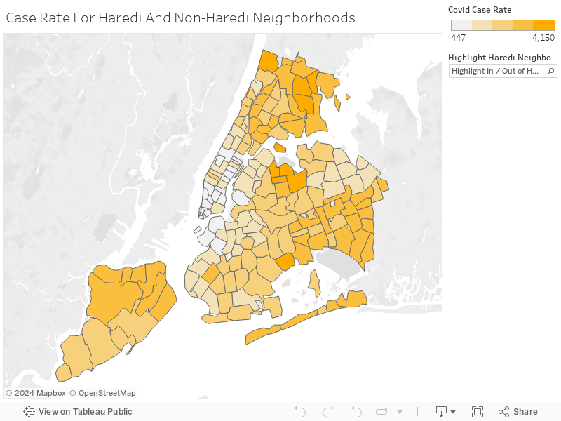
We defined Haredi neighborhoods using census data that show the percentage of people in each tract that speak Yiddish. This is not a perfect measure, but it led us to categorize three New York neighborhoods as Haredi: Williamsburg, Borough Park and Crown Heights. Together, they encompass 12 ZIP codes.
Since it is hard to absorb information the city’s 177 ZIP codes at a glance, I broke them into quartiles by infection rates. One of the 12 Haredi neighborhoods, in Borough Park, landed in the top quartile, meaning it is one of 45 areas with the highest case rate. Half the 12 neighborhoods are in the quartile with the second-highest infection rates (the third quartile); two are in the second quartile, and three in the quartile with the lowest infection rates.
In other words, Haredi neighborhoods are roughly evenly distributed across the spectrum of New York neighborhoods.
This suggests that the much-reported incidents of large funerals or weddings that disregarded social-distancing, and of underground schools and synagogues continuing to gather in person, may have been relatively isolated incidents — or, that similar violations of the guidelines were prevalent in other neighborhoods but garnered less attention.
It also raises questions about the intersection of various demographic factors including race, poverty, age and health-care status.
The relative youth of Haredi areas, a result of their large family sizes, could also be a major factor, given what we know about older people’s particular vulnerability to COVID-19. For example, about 14% of Borough Park is below the age of 5, compared to about 7% of the city overall according to census data.
Another factor may be pre-existing conditions and access to quality health care from before the pandemic. In the most recent health surveys put out by the city before the outbreak, all three of Brooklyn’s Haredi neighborhoods had a higher percentage of adults reporting their own health as “excellent,” “very good” or “good” than both Brooklyn and the city as a whole. It’s possible that Haredi neighborhoods were in better health before the virus than their neighbors.
Of the Haredi neighborhoods, the one with the highest death rate is in Crown Heights.
This map shows the number of COVID-19 deaths per 100,000 people. Two Haredi neighborhoods are in the top quartile of death rates, five are in the third quartile, four are in the second and one is in the bottom quartile. That’s not as even a distribution as the case rate, but it’s only moderately higher.
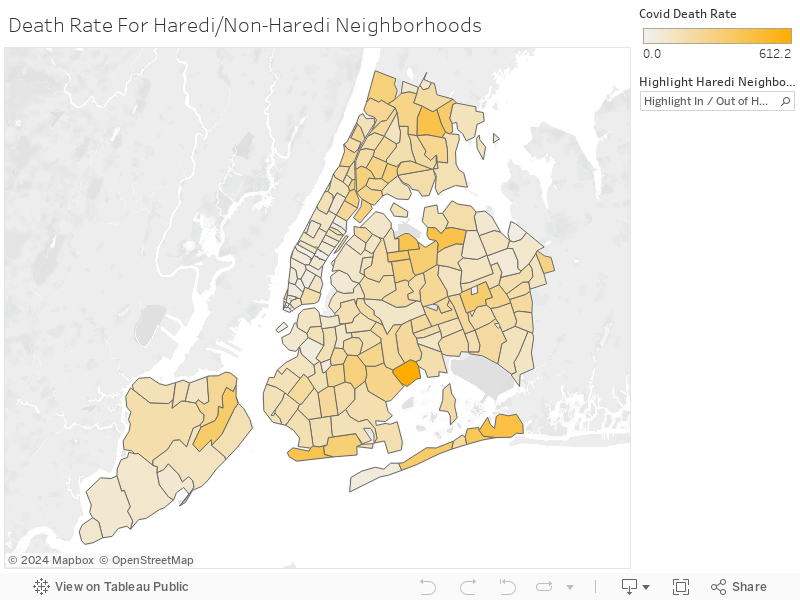
Orthodox and non-Orthodox media, including the Forward, have reported on funeral homes and chevre kadisha that are overwhelmed by the number of dead in Haredi neighborhoods, especially Borough Park. The data raise questions about this: perhaps these examples were a snapshot of a particular spike relatively early in the pandemic — or a reflection of the facilities’ capacity more than the rate of death.
Borough Park did have a high number of deaths, but it also has a relatively large population compared to many other areas, so the rate was not as outsized. I’ll walk through this in more detail in the next visualization.
Of the Haredi neighborhoods, the one with the highest death rate is in Crown Heights, which, in addition to being Jewish, is also a heavily black neighborhood. This is consistent with the evidence nationwide that suggests people of color have died at higher rates from COVID-19.
One Borough Park ZIP code, 11219, has the fourth-highest number of cases in the city, but it also has the 13th largest population.
The health department provided both numbers and rates of cases and deaths by ZIP code. It’s always important to look at rates, not just raw numbers, when trying to compare data sets. Some populous neighborhoods might have had a lot of deaths but relatively few for their size, whereas some less-dense neighborhoods whose total number seems small might have had disproportionately high rates of deaths.
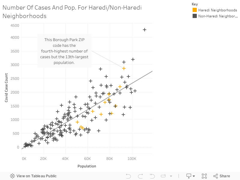
For example, while one Borough Park ZIP code, 11219, has the fourth-highest number of cases in the city, it also has the 13th largest population. This chart illustrates that the number of cases generally correlates to the size of the population.
A helpful way of looking at this chart is to compare ZIP codes that are populational “peers.” ZIP codes that fall along the same vertical line, or close to it, have similar population sizes. You’ll quickly see that some of these “peers” have drastically different numbers of COVID-19 cases.
The higher a ZIP code is off the trend line, the more cases it has for its population size, and the lower it is off the line, the fewer cases it has relative to its size.
It’s possible that unauthorized pop-up testing sites in Borough Park led to a high testing number there.
In this map, the total number of tests administered to people from each ZIP code corresponds to size. The largest bubbles had the highest number of tests. The number of positive tests corresponds to the color. Most of the bubbles are in the two lightest shades of green because more than half of the 177 ZIP codes had their positive testing percentages in the 30-40% range.
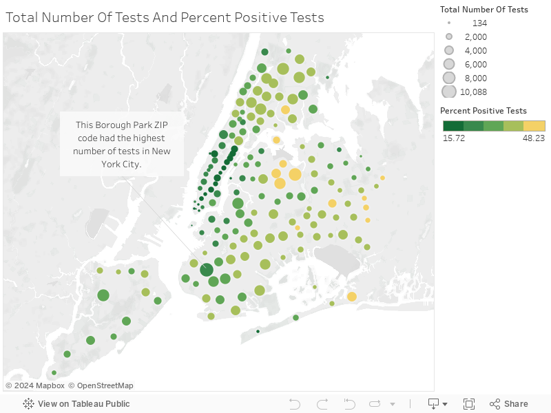
A likely reason why many bubbles are the same color is because until very recently, there was such a high bar for testing. Patients had to have specific symptoms in order to access tests. However, there is a pattern of darker, smaller bubbles throughout Manhattan, which means more people were getting tested who were not actually infected. This likely speaks to how wealthy, white city residents access care more easily through health-care systems than their poor neighbors of color.
One Borough Park ZIP code, 11219, had the highest number of tests in New York City. Since the health department collected testing data from labs as well as hospitals, it’s possible that unauthorized pop-up testing sites in Borough Park early in the pandemic led to this high number.
Limits of the data
Another challenge to analyzing the health-department data is that a lot of relevant demographic information, like race, poverty and age, are not readily available by ZIP code. That makes it hard to correlate the COVID-19 rates with those other factors, which are generally tracked via the census.
Still, the following visualizations explain some of why Haredi neighborhoods were not hit as hard as poor and/or black and Hispanic neighborhoods, and give insight into other factors that impact the Orthodox community.
People between the ages of 65 and 74 did not contract the virus at a significantly higher rate than did people between the ages of 45 and 64.
The chart below shows that while the rate of death and hospitalization is much higher in older populations, the case rate is not, meaning that people between the ages of 65 and 74 did not contract the virus at a significantly higher rate than did people between the ages of 45 and 64.
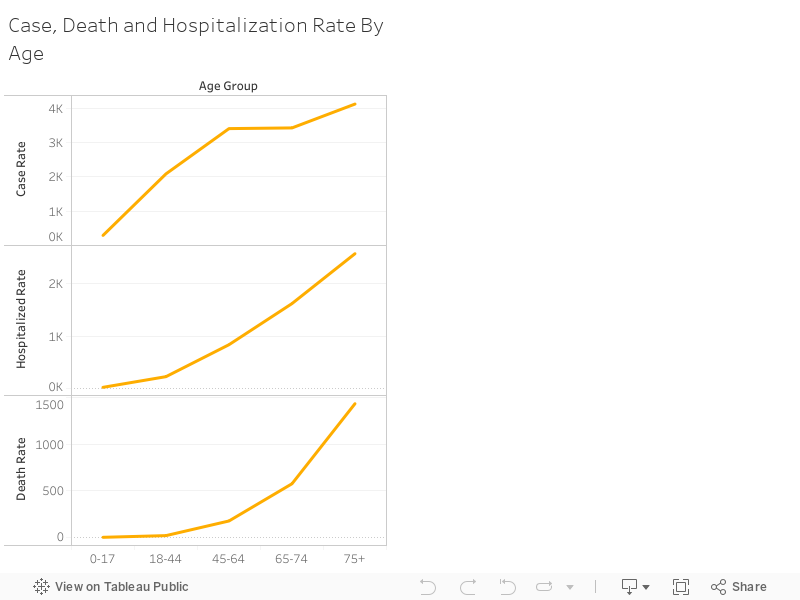
The rates of sickness, hospitalization and death for the 0-17 category are sure to receive additional scrutiny in the coming weeks, as New York State officials fear there has been an undercount.
These groupings were created by the health department, because these were the ranges for which staff noticed patterns.
People living in poverty experience higher rates of COVID-19 infection, hospitalization and death.
This bar graph shows how people living in poverty experience higher rates of COVID-19 infection, hospitalization and death. The health department defines poverty according to the percentage of people earning below the Federal Poverty Threshold (FPT)— the threshold for a family of four is a combined income of $25,926 annually. Very high poverty means more than 30% of residents are living below the threshold.
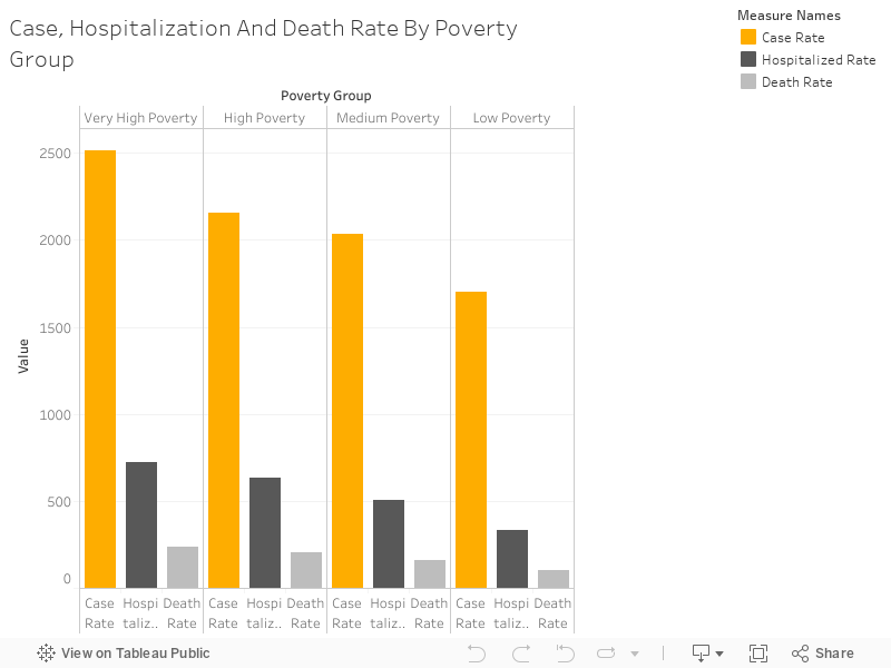
Most poverty data are available by census tract, not by ZIP code, so it is difficult to compare COVID-19 rates to poverty rates on a more granular level. ZIP codes used in other city departments’ demographic data do not match those in the health-department data because the health department uses “modified” codes that create more stable population sizes.
The opinion editor at Jewish Telegraph Agency published this scatterplot using data from ProPublica and New York’s parks department, which suggests that the correlation between poverty rate and infection rate is not as steep as previously thought.
OK, I pulled the data by zipcode and plotted poverty rate vs. infections per 1,000 people. Poverty is a clear, slight correlation with positive cases in the 5 boroughs. I’ll run a regression in a sec. pic.twitter.com/NUU8kczn6Q
— Laura E. Adkins (@Laura_E_Adkins) April 30, 2020
The infection rate by ZIP code is from ProPublica, but those data do not use the same ZIP codes as the health department, so I was unable to verify these relationships. You can read more on the ZIP code issue here.
There are a number of factors that could lead to greater mortality for the city’s poorest residents— studies show that poverty predicts greater stress, less access to preventative healthcare and lower quality of treatment even in developed nations.
Asian/Pacific-Islander New Yorkers experienced the lowest rates of sickness, hospitalization and death.
The next bar graph shows that as in most other cities in the U.S., black and Hispanic residents of New York have been hit harder by COVID-19. There is a more visible relationship between race and infection, hospitalization and death rates than there is between poverty and the disease, which might explain why Haredi neighborhoods with substantial poverty were spared the worst outcomes
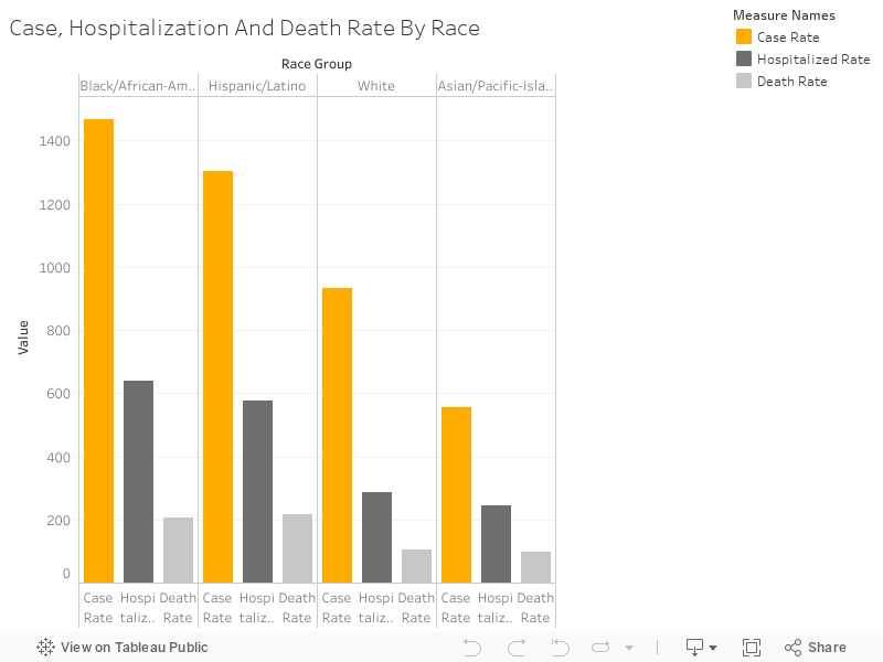
For example, studies show black Americans tend not to access care from primary care physicians, pay more for their healthcare due to their reliance on emergency room visits and have overall worse health outcomes because they experience discrimination in health care facilities and distrust the medical system.
Another interesting finding here is that Asian/Pacific-Islander New Yorkers experienced the lowest rates of sickness, hospitalization and death in the city, despite the perception that Asian-American New Yorkers were spreading the virus, which led to discrimination lobbed at this group during the pandemic. Asian-American community leaders have said New Yorkers of Chinese descent acted quickly, wearing masks and spreading the word about COVID-19 on peer-to-peer messaging services.
Remaining Questions
The unavailability of demographic data by ZIP code leaves many questions unanswered— it would be helpful, for example, to have poverty, race and age information by ZIP code in order to unpack the relative importance of each of these on COVID-19 rates and deaths.
There are other census data available by tract and not by ZIP code that could also be interesting to examine, including citizenship status, receipt of public assistance, gender, the presence of grandparents in a home, educational attainment, disability status, use of public transportation for commute to work, health insurance coverage, occupants per room — the list goes on and on.
Police data regarding social-distancing enforcement are also not available by ZIP code, making it impossible to see if officers have been arresting and issuing summonses in places with high rates of infection, hospitalization and death.
The relationship between hospitalization and death by ZIP code is not clear— are some ZIP codes more likely to see death in the hospital than others?
The data also have the potential to reveal the level of care at different hospitals. How do death rates vary?
The more information we have about how the pandemic affects New York, the more successful we’ll be in our fight against the virus.
Molly Boigon is an investigative reporter at the Forward. Contact her at [email protected] or follow her on Twitter @MollyBoigon

Hello, fellow Forward reader! I’m Joel Brown, a Forward reader and supporter for more than 15 years, and currently the chair of the board of directors.
I’m an avid Forward reader because it ticks so many of my essential boxes: excellent journalism, Jewish focus and diverse viewpoints. In today’s political climate, what I most appreciate is the Forward’s independence — made possible by the generosity of its membership.
The Forward is committed to bringing you unbiased, nuanced Jewish news. From my position as board chair, I see an exciting future as we expand our position as the definitive independent voice of contemporary American Judaism.
That’s why I’m paying it Forward, by matching $36,000 of reader gifts. It’s an investment in the Forward’s newsroom, to continue telling the American Jewish story with truth and independence.
— Joel Brown, Forward board chair
Support our mission to tell the Jewish story fully and fairly.