Reform movement unveils new logos and ‘artistic, abstract’ branding
The Union for Reform Judaism and Religious Action Center have new logos that feature creative lettering rather than Jewish iconography
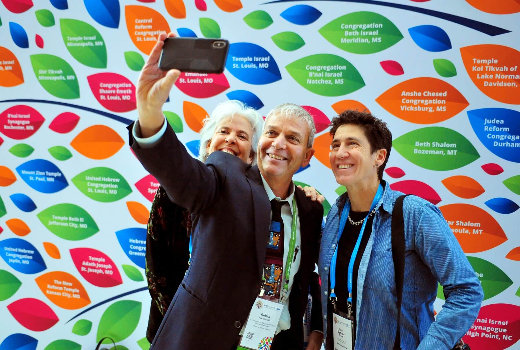
Participants at the Union for Reform Judaism’s 2019 convention in Chicago pose in front of a photo backdrop. The congregational arm of the Reform movement unveiled a new logo and visual brand earlier this month. Photo by Union for Reform Judaism

By Arno Rosenfeld January 31, 2024
Gone is the stylized menorah, variations of which have represented the Union for Reform Judaism for at least 50 years. Also scrapped are the stylized Hebrew letters for chai, or living, the longtime shorthand for the Religious Action Center of Reform Judaism, the movement’s political arm.
Now a series of blue interlocking letters will serve as the logos for two of the Reform movement’s most prominent institutions, part of a branding “update” following the URJ’s 150th anniversary last year.
While the most overt Jewish symbols from past logos were removed, a series of nine new “shapes” were created to be used in URJ marketing materials. They include classics, like the Star of David, menorah and dove, alongside more conceptual icons like a series of dots meant to evoke “belonging” and “shared humanity.”
“The design elements represent an artistic, abstract brand identity that feels modern, expands the definition of ‘belonging,’ and is inviting to not-yet-engaged Jews,” Laura Frank, a spokesperson for the URJ, said in an email. “These elements invite everyone to find their own Jewish identity within the URJ.”
The Reform movement, like many other Jewish organizations, has historically used blue in their logos to reflect the religious and cultural significance of the color in Judaism, and the new URJ icon uses a lighter shade of the color.
The URJ worked with Jared Schwartz at Outright, a branding firm that has worked with Adidas, Marriott and Capital One, on the project.
The URJ’s previous logo, a seven-branched candelabra, had been used since the Reform movement’s congregational arm was called the Union of American Hebrew Congregations.
(The UAHC became the URJ in 2003 to reflect what then-president Rabbi Eric Yoffie described as “a change in essence,” in the umbrella institution of the largest Jewish denomination in North America.)
It is not clear precisely when the stylized menorah was first used, although a variation on it — a candelabra growing out of “uahc” was used as early as 1973, when the organization celebrated its 100th anniversary.
Reform Jews weigh in
Reactions to the logo were mixed on social media. It received dozens of “likes” on the URJ’s Facebook page when it was unveiled on Jan. 17, although some took issue with how the letters blend together. “I find this logo hard to read,” wrote Lisa Kaplan. “And I want to like and embrace it.”
Lisa Helfman Gottman said she also found it “confusing” and a poor use of resources. “I think Reform Judaism has more important issues that need to be dealt with, but I am just a Jew in a pew,” she wrote.
Others focused on the new aesthetic, which some felt evoked the 1970s.
“It’s giving opening sequence from the Partridge Family,” wrote Laura Bramson Hyman, referencing the sitcom popular during that decade, which began its show with a series of colorful abstract bird shapes.
The Religious Action Center’s new logo, which features the same lettering as the URJ’s mark but with a circular green background, received less attention on Facebook.
Frank, the spokesperson, described the RAC logo as “bold” and said it “reflects its progressive and action-driven characteristics.”
The RAC, which is based in Washington, D.C., had used the Hebrew letters for “chai,” which carries symbolic weight in Jewish culture as an affirmation of life and good fortune, although its branding has been less consistent than the URJ’s. Its first website featured a blue and yellow color scheme with the Hebrew letters in the background.
The color scheme switched to turquoise, navy blue and white in 2012, although the “chai” has remained adjacent to the organization’s name in all these variations.
Recent Jewish rebrands
Other Jewish organizations and denominations, including the Orthodox, Conservative and Reconstructionist movements, have also undergone rebrandings since the URJ last shook things up.
In 2008, the Orthodox Union unveiled a new logo featuring a “U” overlaid on top of an “O,” part of a marketing push to emphasize that the modern Orthodox denomination “does much more than certify kosher food.”
In 2015, the United Synagogue of Conservative Judaism paid $350,000 for an overhaul that included swapping its flame logo for a series of interconnected “U” shapes that create a Star of David. And three years later, the Reconstructionist Rabbinical College and Jewish Reconstructionist Communities became “Reconstructing Judaism.”
The Anti-Defamation League revealed new branding in 2018; the Women of Reform Judaism unveiled a new logo two years ago; and the National Council of Jewish Women has recently begun regularly using its original blocky logo from the early Twentieth Century.

Hello, fellow Forward reader! I’m Joel Brown, a Forward reader and supporter for more than 15 years, and currently the chair of the board of directors.
I’m an avid Forward reader because it ticks so many of my essential boxes: excellent journalism, Jewish focus and diverse viewpoints. In today’s political climate, what I most appreciate is the Forward’s independence — made possible by the generosity of its membership.
The Forward is committed to bringing you unbiased, nuanced Jewish news. From my position as board chair, I see an exciting future as we expand our position as the definitive independent voice of contemporary American Judaism.
That’s why I’m paying it Forward, by matching $36,000 of reader gifts. It’s an investment in the Forward’s newsroom, to continue telling the American Jewish story with truth and independence.
— Joel Brown, Forward board chair
Support our mission to tell the Jewish story fully and fairly.