Why does this logo for Israel’s 75th anniversary look like a Philadelphia 76ers knockoff?
Making the ‘Diamond Jubilee’ a Philly special
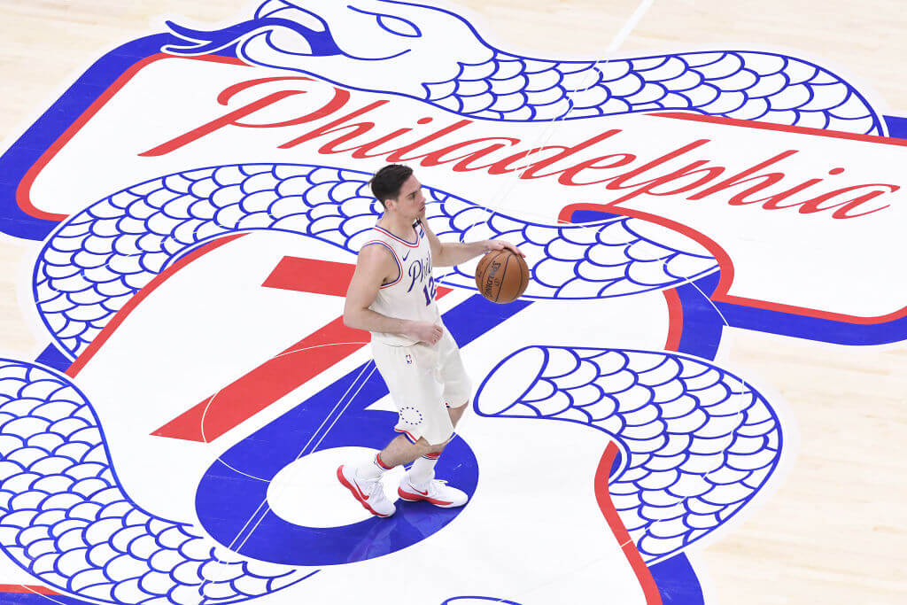
T.J. McConnell of the Philadelphia 76ers brings the ball past the “Phila Unite” logo in the 2018 NBA Playoffs. Photo by Matteo Marchi/Getty Images

By Louis Keene March 3, 2023
“I’m glad you’re noticing the logo,” American Zionist Movement executive director Herbert Block said when I called him Thursday afternoon to discuss something that had been nagging at me.
You see, Israel will mark the 75th anniversary of its independence this year, and AZM commissioned a logo for American Jewish communities to use in conjunction with their celebrations. The assignment was straightforward, Block told me: It needed the number 75, plus some English, some Hebrew, American and Israeli flag colors, and gold for a celebratory finish.
I came across the finished product for the first time at our synagogue’s annual gala, and didn’t think much of it — that is, until a friend, with a wry smile, showed me this logo used by the Philadelphia 76ers:
LEFT: Israel official 75th Anniversary logo (2013)
— Louis Keene (@thislouis) March 1, 2023
RIGHT: Philadelphia 76ers alternate logo (2018) pic.twitter.com/1IQ0QrFCs6
The Israel 75 logo features an interconnected red seven and a blue five; the 76ers’ — an alternate introduced before their 2018 playoff run that was popular enough to stick around — has a different second digit, obviously, and the numbers have space between them. Plus there’s a snake winding through it, a reference to Benjamin Franklin’s “Join, or Die” rallying cry in the pre-independence U.S.
Still, between the color scheme and the orientation of the digits, the emblems look kinda similar.
“Maybe people will celebrate more in Philadelphia, because of the logo,” Block said with a chuckle.
The design guidelines for the Israel 75 logo, which the AZM published on its website, make clear that the design is the work of graphic artist Valeria Wallentin, whose website lists work in Israel, Mexico and the U.S. Block said he did not think she had any connection to Philadelphia. (I reached out to Wallentin through her website Thursday, but she did not respond.)
Anyway, the more I studied the two logos side by side, the less similar they looked. Besides, if you’re going to create a 75th anniversary logo with red and blue numbers, they’re always going to kind of look similar, right?
Just for the hell of it, I googled “75th anniversary logo” to see what would come up. (I also tried DALL-E, and got nowhere.) It turns out that there are, indeed, countless ways to render a seven and a five together. But that doesn’t mean no two are alike.
And some are more alike than others. The fourth result — created in 2021 for a Kentucky-based sign company — was even closer to AZM’s.
In any event, Block told me Wallentin had sent him several options and he picked the one he liked the best. So I guess we know who he’ll be rooting for in the playoffs.
I’m personally matching all gifts to the Forward, up to $36,000. Can I match your gift now?

Hello, fellow Forward reader! I’m Joel Brown, a Forward reader and supporter for more than 15 years, and currently the chair of the board of directors.
I’m an avid Forward reader because it ticks so many of my essential boxes: excellent journalism, Jewish focus and diverse viewpoints. In today’s political climate, what I most appreciate is the Forward’s independence — made possible by the generosity of its membership.
The Forward is committed to bringing you unbiased, nuanced Jewish news. From my position as board chair, I see an exciting future as we expand our position as the definitive independent voice of contemporary American Judaism.
— Joel Brown, Forward board chair
Support our mission to tell the Jewish story fully and fairly.