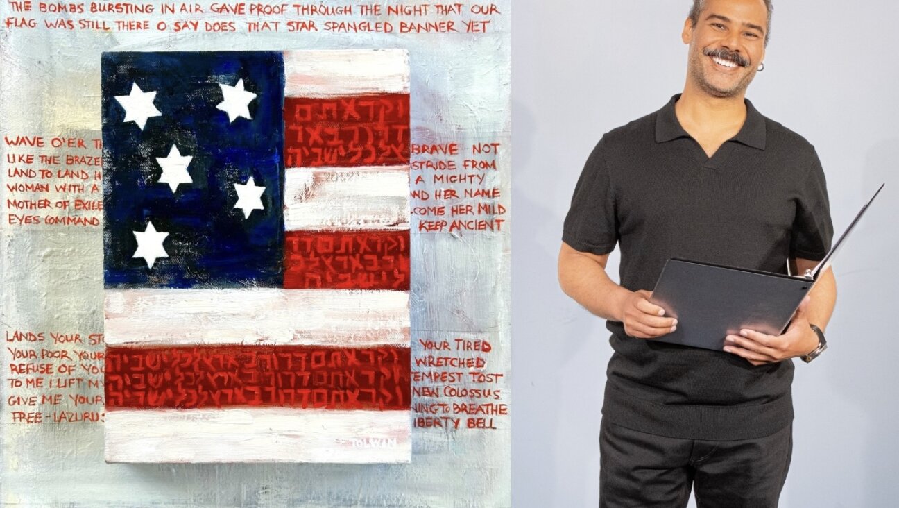
In the rarified world of Jewish letters, a mind-boggling font of Jewish history
Faux-Hebrew text has become ubiquitous, but did it start out as something Jewish or antisemitic?
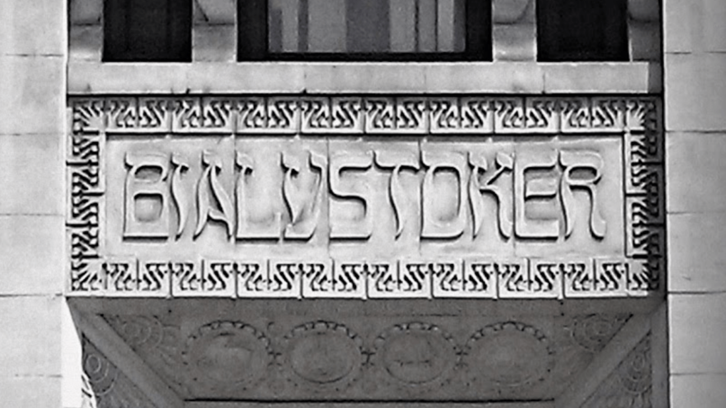
Facade of the 1931 Bialystoker Home for the Aged on New York’s Lower East Side. Courtesy of courtesy of Elissa J. Sampson

By Andrew Silverstein July 22, 2022
In the early 1990s, a new teriyaki sauce reached New York supermarkets with a distinctive label. In faux-Hebrew font, the name “Soy Vay — Veri Veri Teriyaki” was spelled out. The S was Hebraized by exaggerated serifs; the Hebrew letter samekh (ס) was contorted into an O; an ayin (ע) was passed off as a “Y.”
“You can’t be Jewish, walk by and not buy it,” the brand’s co-founder Eddie Scher told SF Gate in 2003. He was right. My family snatched up a bottle at first sight, and we weren’t the only ones. In 2011, Scher sold the California company to Clorox.

There’s really nothing Jewish about teriyaki, but the branding works. Jews love Asian food and self-deprecating humor. The lettering takes an inauthentic Asian product and makes it Jewish.
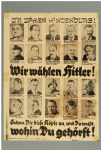
You’ve probably seen faux-Hebrew in kitsch marketing or on deli menus, but there’s a darker side to it too. A 1932 Nazi presidential campaign poster spelled out “We choose Hindenburg” in Hebraized lettering, associating Hitler’s Christian opponent with Jews through typographical innuendo. In contrast, “We choose Hitler” was spelled out in German blackletter.
The dichotomy is fascinating. On the facade of the Second Avenue Deli, it feels whimsical, but on a yellow star at an anti-vax rally, it is the font equivalent of a hooked nose.
“It’s a trope,” said Steven Heller, co-chair of the School of Visual Arts MFA program and author of “The Swastika and Symbols of Hate.” And not just an antisemitic one. “The words’ Chicken Soup’ in the style of Hebrew lettering,” he offered as a positive cliché, “they make you feel better when you’re sick and come from a Jewish grandmother’s recipe book.”
To make the English alphabet feel Yiddish, a designer must reverse the stresses and serifs, reflecting that Hebrew is written from left to right. I asked Heller how much of a technical challenge this was. “You take the Hebrew letter and just adapt it. You stretch it,” he said dismissively, adding that some letters can be borrowed unchanged or inverted. “It’s easy if you know what you’re doing.”
Faux-Hebrew is one of many “ethnic fonts.” The most well-known are the Chop Suey characters once commonly found on Chinese takeout boxes. Most designers look down on ethnic fonts, calling them “garbage fonts.” They are a shortcut to announce ethnicity, often used in marketing, in light-hearted jokes or as vicious slurs. Even if they’re not offensive, they’re seen as gimmicky and hard to read.
But faux-Hebrew differs from the Chop Suey fonts, which have been criticized in recent years. Chinese- and Japanese-like fonts were first created in the 19th century by white Americans to exoticize and ridicule Asians. Later, Asian Americans co-opted the lettering mainly to market their food to non-Asians. In contrast, Jews themselves are the ones who most often use Hebraized lettering as an inside joke.
Perhaps a key difference is that faux-Hebrew does not play off cultural stereotypes in the same way as the bamboo lettering that invokes Asia or the festive Tamale font that’s used in Mexican restaurants. And while Chop Suey fonts are supposed to mimic east Asian calligraphy, they really don’t. Faux-Hebrew, like the Greek-like font found on coffee cups, resembles an actual script, giving it authenticity and a more dignified feel.
Still, how far back does faux-Hebrew go? Was it originally playful or hateful or something entirely different? Moreover, who did it first: Jews or antisemites?
Heller said he guessed the font dated back to vaudeville. He generously emailed experts in the font world, including a former rabbi, but no one knew for sure. Likewise, Hebrew typography textbooks only cover actual Hebrew, and while I found critiques of the lettering in academic texts, no one had ever dug into its history.
When I asked a librarian at the Dorot Jewish Division of the New York Public Library, I’m pretty sure she rolled her eyes. It was the equivalent of asking the American Irish Historical Society about the origins of the “Kiss Me I’m Irish” T-shirt.
Sarah Bunin Benor, a professor of linguistics and contemporary Jewish studies, and director of the Jewish Language Project at the Hebrew Union College, said that her colleagues view the font with disdain. “A designer for one of my books wanted to use that font for the book title,” she told me. “And I said, ‘No, it’s just not appropriate because it has this mocking or comedic effect.'”
None of this is surprising. A downloadable version of the font is called “Circumcision,” and it’s most often encountered on goofy “I ✡ Shiksas” T-shirts or sappy “Bubbe” mugs, not serious academic texts. Still, I must admit I like faux-Hebrew, and it’s not just because I have a weak spot for tchotchkes. I’m a third-generation New York Jew. Doesn’t English hinting at Yiddish represent my secular Jewish-American identity?
So, When Did Faux Hebrew Start Anyway?
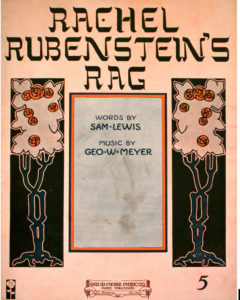
To determine the origins of Faux Hebrew, I started looking in the Vaudeville era. The oldest example I found was the cover art for the sheet music to the 1912 song “Rachel Rubinstein’s Rag.” It looks artful with art nouveau flourishes. The apostrophe and C are borrowed from the Hebrew alphabet, while the other letters are given a Yiddish accent with exaggerated serifs.
The music itself is far from subtle. It’s a Jewish minstrel song, which would have been performed in Jewface: raggedy dark clothes, a fake beard and a hooked nose — the Jewish version of the racist acts that mocked the Irish, Italians, Chinese Americans and, most commonly, African Americans.
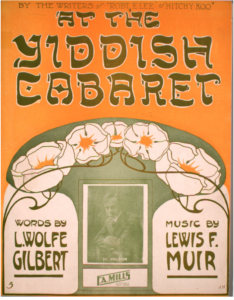
Surprisingly, the Jewish songs, which used stereotypical melodies, were mostly written and performed by Jews for a mainly Jewish audience. Al Jolson, a Jewish star of the ragtime era, performed “At The Yiddish Cabaret.” Its 1913 sheet music also has Hebraized lettering.
“The lyrics trafficked in stereotypes about Jews, some funny, some offensive, some both,” said journalist Jody Rosen who in 2008 put together “Jewface,” a compilation of the Jewish dialect music.
“A faux-Hebrew font is analogous. It’s a graphic design stereotype,” he wrote me in an email. “Like the songs that mixed American pop with traditional Jewish musical flavors, the blend of Latin script with Hebrew forms is a visual joke that would have tickled Jews especially.”
So, did faux-Hebrew start as an ethnic joke?
I didn’t think so.
A Clue to the Mystery
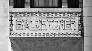
I had long known a different side of Faux Hebrew typography from the Bialystoker Home for the Aged, located down the block from the Forward Building on New York’s Lower East Side. Above the main entrance, Bialystoker is carved in stone. The letters resemble Hebrew but are not strained or distorted. They’re elegant and surrounded by a pattern of the Hebrew letter ayin (ע) above engravings of the 12 tribes of Israel.
Jewish immigrants from Bialystok, Poland, funded the 1931 art deco building as a home for their elderly landsmen. The elaborate lettering and artwork must have been a substantial expense for the immigrant community during the Great Depression. This faux Hebrew was no joke.
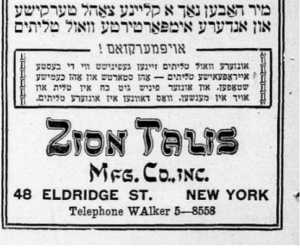
This isn’t the only serious example in the neighborhood from that era. In 1930, two renovated tenements on Ludlow Street were given art deco flourishes and branded with the name “Esther Apartments” in Hebrewesque letters. And in 1937, Zion Talis, a Judaica store blocks away from the Bialystoker Home, started running ads spelling out their name in similar lettering, matching their awning.
After the Jewish nursing home closed in 2011, preservationists and community members successfully petitioned the city to grant the building landmark status, saving the historic facade from the whims of developers.
“The sign announcing ‘Bialystoker’ is one of my favorite details in New York and an amazingly pointed symbol of our history,” architectural historian Andrew Scott Dolkart wrote in 2012 to the Landmark Preservation Commission. “Here we have English letters written out as if they were Yiddish script.
“What an amazing statement about immigration and assimilation, as Yiddish becomes English and immigrants become Americans,” Dolkart said.
But Yiddish becoming English also implies the loss of Yiddish for most American Jews. In his book “Adventures in Yiddishland,” Jeffrey Shandler, Distinguished Professor of Judaic Studies at Rutgers University, laments that Yiddish is often treated not as a living language but as a symbol for comedic or nostalgic effect. Worse perhaps is faux-Hebrew: English masquerading as Yiddish.
Shandler credits faux-Hebrew for being widely accessible and marking words as “distinctively Jewish,” but adds, “The use of these fonts thus resembles ‘kosher-style’ cuisine, preserving manner while altering, even subverting, substance.”
Certainly, the Yiddish-speaking Bialystok immigrants didn’t stereotype themselves the same way Jewish vaudeville acts did, but was this a celebration of their assimilation? News coverage at the time did not comment on the artwork, and the artist’s name has been lost to history, but there is a clue.
Elissa J. Sampson, an urban geographer, has studied the nursing home artwork. She notes that the use of roundels and illustrations of the 12 tribes of Israel almost exactly match the icons on the bronze doors of Temple Emanuel on Fifth Avenue completed the previous year. This suggests the uptown synagogue and downtown nursing home were designed by the same artist, Joseph B. Abrahams.
Sampson’s hunch appears to be correct. Abrahams, the secretary of the Jewish Theological Seminary, illustrator and calligrapher, was born 50 miles from Bialystok. He designed a Hebrew font for a printing of the Talmud and was proficient in Arabic lettering and hieroglyphics.
“He can adapt any of them to English script so that the writing is decipherable by the average reader but carries the feeling of another script,” The Patent Trader, a Westchester weekly, wrote in 1961.
Abrahams used faux-Hebrew to design bookplates, decorative labels placed on the inside covers of books to show ownership. Prominent early 20th-century Jewish American leaders, including Solomon Schechter, the architect of Conservative Judaism, were among Abrahams’ customers.
When a Bookplate Tells a Story of its Own
Bookplates, or in Latin “ex libris” (from the library of), were popular from the late-19th to the mid-20th century. Faux-Hebrew appears in many Jewish bookplates in North America and Europe, dating back to 1904, almost a decade before the sheet music I had seen. But here, the lettering is part of a well-thought-out personal statement.
The artist Joanne Bauer-Mayer told The Jewish Weekly Times of Boston in 1943 that it took her an entire year to design the ex libris of Dr. Joshua Loth Liebman, a prominent Boston Reform Rabbi, and bestselling author. “A bookplate must be an indication of the background, personality and ideals of the man,” she explained.
Bauer-Mayer’s final design features Maimonides looking down from a window in the rabbi’s temple. Below are the rabbi’s favorite religious texts, the seal of Liebman’s alma mater, and musical notes for the singing of the Shema prayer. At the bottom is written in faux-Hebrew: “Ex Libris: Dr. Joshua Loth Liebman.” The bookplate was later partially replicated on his tombstone.
Bookplates also often feature hobbies, professions and political allegiances. For example, in 1910, Maksymilian Goldstein, a Polish Jewish art critic and collector, commissioned the Polish artist Rudolf Mękicki to design his bookplate. A native of Lviv (then Poland, now Ukraine), Goldstein is remembered for his heroic efforts to save his private museum of east European Jewish folk art and Judaica from the Nazis, who eventually murdered him and his entire family.
In 1935, Goldstein co-authored a Polish-language book on his vast collection, which reproduced and explained his ex libris. In the center is a book about coin collecting. At the top are two coins from the Jagiellon royal dynasty of Poland; one features a cross. They are connected to a star of David and a menorah, signifying Goldstein’s intense interest in Polish Jewish objects. A thorny vine wraps around the illustration, a motif that represents Jewish suffering in exile — imagery borrowed from Christianity.
The bookplate, which features the coat of arms of the King of Poland and Zionist symbols, both Christian and Jewish imagery, distills this complex identity with the Hebrew-looking lettering at the bottom, which reads in Polish: “Maksymilian Goldstein in Lviv.”
“It is a kind of mixing of identities,” said Nicholas Block, a Boston College professor who has studied Jewish bookplates. “For people to have their names in this faux-Hebrew font shows that they are both of them,” meaning both Jewish and American or Polish and Jewish, for example.
What’s surprising is that a font that seems so clearly a celebration of hybrid identities has its roots in the Zionist movement, which questioned Jewish assimilation.
An Artist Named Lilien Enters the Story
Searching for a style of lettering can be tedious. It means clicking through endless arrays of online images or flipping through dusty books at the library. But sometimes, the answers are out in the open.
Goldstein cited Ephraim Moses Lilien as the inspiration for his ex libris, so I decided to explore the work of this mostly forgotten turn-of-the-century Jewish artist, considered to be the father of Jewish bookplates. I thought it would be another rabbit hole, but then I immediately saw it.
The letters are perfectly balanced and elegant, the work of a celebrated artist, not a cheap gimmick. At the time, the philosopher Martin Buber wrote a review in the Zionist weekly Die Welt, “I enjoy all of it — the cover in our colors: ‘Juda’ in white beams forth from a dark blue cover; the letters are shaped like Hebrew letters and evoke a sweet homey atmosphere.”
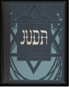
Lilien was born in Drohobycz, Galicia (located in present-day Ukraine), and moved to Germany in 1897 to study art. There, he embraced jugendstil, the German counterpart of art nouveau, and became a Socialist Zionist. In “Juda,” his flowery black ink sketches of scenes from the Torah are paired with verses by the Christian poet Börries von Münchhausen. In that era, the Jewface image of Jews as meek, downtrodden figures in dark overcoats was most common. Here, Jews appear as attractive, strong and triumphant epic heroes.
The book became an instant success and was translated into multiple languages. Zionists championed “Juda,” finding in Lilien’s modern drawings a uniquely Jewish art form and an inspiration for the “new Hebrew man.” The following year, Lilien organized the art exhibition of the Fifth Zionist Congress and, in 1906, helped open Bezalel, the first design school in the future state of Israel. He became known as “the first Zionist artist.”
Lilien created the iconography for the Zionist movement, but more broadly, he pioneered the art of a modern secular Jewish identity. Religious symbols like the Star of David or menorahs took on new meaning when paired with art nouveau nude femme fatales and modern, even sometimes Christian motifs.
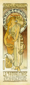
Lilien’s work was influenced by his era’s leading artists. Many have noted that his illustrations in “Juda” make reference to the drawings of the British Aubrey Beardsley known for his provocative depictions of virile men and female temptresses. He was also inspired by Gustav Klimt and the Czech art nouveau master Alphonse Mucha. Indeed, Mucha used hebraiczed lettering in his 1897 poster in Paris for the renowned actress Sarah Bernhardt. While the lettering differs in style, the poster for the play “La Samaritaine,” clearly influenced Lilien’s use of faux-Hebrew.
This suggests an ambiguous start for faux-Hebrew. Bernhardt, a leading actress of her day, was the illegitimate daughter of a Dutch Jewish woman, but was raised French Catholic. In “La Samaritaine,” by Edmond Rostand, who within a year would pen “Cyrano de Bergerac,” Bernhardt plays a Jewish prostitute in Samaria who after meeting Jesus leads her people to convert to Christianity.
Three years later, Lilien, with “Juda,” made faux-Hebrew a truly positive statement of a Jewish-identity, not a way to highlight the exotic and unusual beauty of a sinful Jewess waiting to be saved by Jesus. Lilien turned faux-Hebrew into part of the new Jewish visual vocabulary embraced by Zionists and non-Zionists. Even the 12 tribes of Israel on the Bialystoker Home facade seem to be inspired by a Lilien illustration.
Ori Soltes, a professor at Georgetown University’s Center for Jewish Civilization who researches Jewish art history and identity, told me “Juda” appeared right when the idea of making Hebrew the Jewish national language was percolating. “I think the reason you have that play with Hebrew letters is in part to put them front and center as an art form,” said Soltes.
It was only after “Juda,” in nearby Leipzig, Germany that Raphael Frank created the first modern Hebrew font in 1908. The clear and crisp Frank-Ruhl font is still the most ubiquitous Hebrew font today.
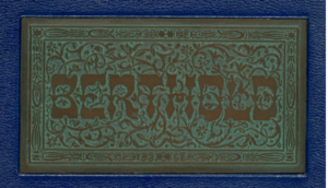
It’s clear that Lilien’s letters were on the minds of the Hebrew type designers who came after him. Letters like the ones on “Juda” appear on the cover of the landmark 1924 Hebrew typography catalog by the Berlin foundry H. Berthold. Then in New York, the Hebrew Monotype Press uses faux-Hebrew on the cover of their 1927 specimen book, Lilien’s illustrations accompany the Hebrew and Yiddish sample texts. Serious Hebrew font designers saw faux-Hebrew as something more than a cheap knock-off.
Lilien grew up speaking Yiddish in a religious household, but his biggest proponents were educated German-speaking Jews who did not grow up with Hebrew or Yiddish. Block calls them a “post-assimilation” generation — the descendants of German Jews who had lost their traditions now yearned for a Jewish identity.
Block, who is working on a book titled “Schlepping Culture: The Jewish Renaissance Between German and Yiddish,” called the “Juda” cover a bold and confrontational representation of Jewishness for German society, the opposite of Jewface. “This is in-your-face proudly ethnic,” he said. “It’s pushing Jewish ethnicity in the face of its readers.”
If the Bialystoker facade in 1931 represents Jewishness dissolving into the fabric of America, “Juda” in 1900 represents a Jewishness emerging from German society. But this didn’t mean an abandonment of German-ness.
Early Zionists saw themselves as cultured Western Europeans looking to their Eastern roots for authentic Jewishness. This mix is neatly summed up in the masthead Lilien designed in 1901 for Buber’s journal of Jewish art, “Ost und West” (“East and West”).
The O in “Ost” is covered with a flourish that resembles a yarmulke, the head covering of observant Jews, the W in “West” is crowned by a mustache shape, symbolizing the westernization of the traditional Jewish beard,” said Texas A&M University professor David Brenner in his book “Marketing Identities: The Invention of Jewish Ethnicity in Ost und West.”
Lilien never reused the lettering, but he tapped into the zeitgeist. In 1904, Hebraized Cyrillic showed up in St. Petersburg on the masthead of the Russian-language literary journal “Jewish Life.” Then, in 1916, the first Brazilian-Jewish publication in Portuguese, “A Columna,” chose faux-Hebrew for the title. The following year, “Vida Nuestra” debuted in Buenos Aires. The Spanish-language publication featured Lilien-like illustrations and a faux-Hebrew logo.
Bunin Benor believes the use of the lettering mirrors how Ashkenazi Jews carried over Jewish terms and phrases to their new languages. The faux-Hebrew, she said, represented “part of the shift from Yiddish, which is written in Hebrew letters, to Polish and Russian and Czech and German and English and all the languages Jews acquired in the 19th and 20th centuries.”
Font as a Statement of Identity
In an essay written for a 1993 Cooper Union exhibition that examined everyday graphic design, Sojin Kim and Somi Kim wrote that ethnic fonts are a visual manifestation of anthropologist Michael M.J. Fischer’s concept of bifocality — “seeing others against a background of oneself and oneself against a background of others.”
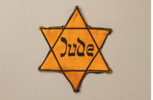
In the first part of the 20th century, faux-Hebrew’s meaning changed according to the varied circumstances and perspectives of Ashkenazi Jews. Then, during the Holocaust, it took on a very different and indelible meaning. In some countries, the yellow star patches that the Nazis forced Jews to wear included “Jew” written in faux-Hebrew.
In the years following World War II, it’s hard to find faux-Hebrew. Not only was the lettering tarnished, but Soltes explained, the Holocaust brought on “a radical discomfort with how to express or whether to express one’s Jewish identity.” Eventually, though, faux-Hebrew came back.
Bookplates had become passe in the postwar era. Instead, the lettering found a home in American consumer culture.
Shandler dedicated a chapter of his book to dissecting his collection of tchotchkes dating back to the 1940s. Many of the gag gifts, T-shirts and games feature a single Yiddish word, often written in faux-Hebrew. He sees the mock dictionaries and refrigerator magnets as using Yiddish as a symbol, not a language. The gag gifts, he said, were a “gesture of cultural homage, on the one hand, and as a tacit acknowledgment of cultural breakdown on the other.”
Examples of faux-Hebrew are found on the more than 400 Jewish-American record album covers from the 1940s to 1970s that Robert Bennett and Josh Kun include in their 2008 book “And You Shall Know Us By Our Trail of Vinyl.” The Hebraized lettering started appearing in 1950 as a kitschy stand-in for actual Yiddish.
There are, of course, exceptions. The lettering comes across as serious on some Israeli music records, such as a 1950 liturgical record (albeit a pretty unorthodox one for the era, given the cantor is a woman), and a 1971 Zionist audio documentary called “Never Again.” Similarly, the first edition of Leon Uris’ 1958 best-seller Exodus uses the lettering in the cover art.
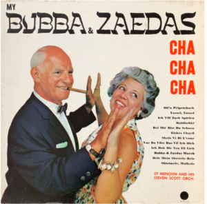
But the lettering is generally used for a comic or nostalgic effect, as in the 1959 album “My Bubba and Zaeda’s Cha Cha Cha,” or the 1960 Yiddish lullabies album “A Mama sings Liedele.”
The mid-1960s marked another tuning point for faux-Yiddish. By then, according to Bunin Benor, American Jews had become more comfortable with their ethnic identities, and other Americans found an interest in Jewish culture, adapting many Yiddish loanwords. At the same time, the introduction of phototypesetting reduced the price of making commercial fonts.
“The 1960s and early 1970s saw an explosion of new styles,” Florian Hardwig, a Berlin-based designer and managing editor of the online archive “Fonts In Use,” said via email.
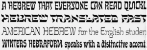
According to Hardwig, in 1963, Charles Papirtis, a Lithuanian-American artist, designed the first faux-Hebrew typeset, Papirtis Maseltov. Up to this point, graphic designers had to draw Hebrewesque letters by hand or use typefaces that just happened to have a Hebrew-like feel. Commercial faux-Hebrew fonts allowed businesses to easily use the lettering on advertisements, deli menus and eventually swag.
Papirtis wasn’t making a statement about Jewish identity. Hardwig said that he was the ethnic typecast artist of Photo-Lettering, an iconic New York font company. In this role, he designed fonts with playful names like Vodka, Shish-Ka-Bob, Taj Mahal and Buddhist that mimicked Cyrillic, Arabic, Hindi and Thai.
He also went on to create two more faux-Hebrew fonts, the 1964 Papirtis Shalom and the 1969 Papirtis Temple. His Papirtis Maseltov font has been copied into many digital fonts under the names Tanach and Kosher, among others.
A Font Still Flourishes, More Than a Century Later
When Hebraized Latin became a typeset, it was typecast. Fonts, like other visual cues, work by repetition. Over time, the Hebrewesque Latin script became linked to kitsch. This dulled its associations with Nazis but also drowned out any other possible uses.
Still, it remains popular. The streetwear company Only NY emblazons “NY” in faux-Hebrew on hats and sweaters, as part of their “deli” line. Jake Cohen, the author of the cookbook “Jew-ish,” used the lettering on a promotional tote. When on television or broadcasting to his 1.4 million followers on TikTok, Cohen wears Jewish-themed T-shirts. “I’m trying to convey that I’m proud to be Jewish and proud of our culture,” he said in an email.
I wear faux-Hebrew shirts and hats for similar reasons. As a non-Orthodox Jew, they show my Jewishness in a way that feels authentic to me. The T-shirts that spell out Yankees or Hunter College phonetically in actual Hebrew letters seem too insidery and better suited for someone who actually reads Hebrew, not just sounds it out.
But faux-Hebrew designs are almost always described as “old school” or “vintage style.” They’re stuck in the 1960s, evoking nostalgia and Catskills comedy acts. Long forgotten are its serious uses as a bold representation of ethnicity, a celebration of a Jewish American identity, and a symbol of Zionism.
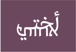
Israel is the one place where faux-Hebrew is evolving and making a statement. There, Hebrew is being merged with Arabic. Haifa-based designer Liron Lavi Turkenich has invented lettering called Aravrit. Each letter is designed so that the top is a recognizable Arabic character, while the bottom is Hebrew.
The Israeli designer’s goal was to make a font legible to all the residents of her city. A nearly 16-foot-tall sculpture that spelled out “Toward Tomorrow” in Aravrit was displayed in the Israeli pavilion at an International Expo in Dubai. However, Turkenich stresses that her project is apolitical. Mostly, she makes T-shirts and necklaces with words like “Sister,” “Life,” or simply, “Human.”
“You’re connecting stories, you’re connecting letters, and it comes across on very different levels,” she said, adding that the font allowed her to connect with her Arab neighbors and Mizrahi Jews to celebrate an Arabic heritage often stigmatized in Israel.
Of course, Turkenich, a native Hebrew speaker, resisted the label faux-Hebrew; she uses actual Hebrew and actual Arabic. But when I showed her Lilien’s “Juda” cover and the Bialystoker Home, she instantly saw the parallels.
Over a century ago, Lilien infused Latin script with Hebrew to give a voice to a Jewish minority. Now, Hebrew, the language of a majority, is being fused with Arabic to start a conversation. A century later, faux-Hebrew still has something to say.
I’m personally matching all gifts to the Forward, up to $36,000. Can I match your gift now?

Hello, fellow Forward reader! I’m Joel Brown, a Forward reader and supporter for more than 15 years, and currently the chair of the board of directors.
I’m an avid Forward reader because it ticks so many of my essential boxes: excellent journalism, Jewish focus and diverse viewpoints. In today’s political climate, what I most appreciate is the Forward’s independence — made possible by the generosity of its membership.
The Forward is committed to bringing you unbiased, nuanced Jewish news. From my position as board chair, I see an exciting future as we expand our position as the definitive independent voice of contemporary American Judaism.
— Joel Brown, Forward board chair
Support our mission to tell the Jewish story fully and fairly.