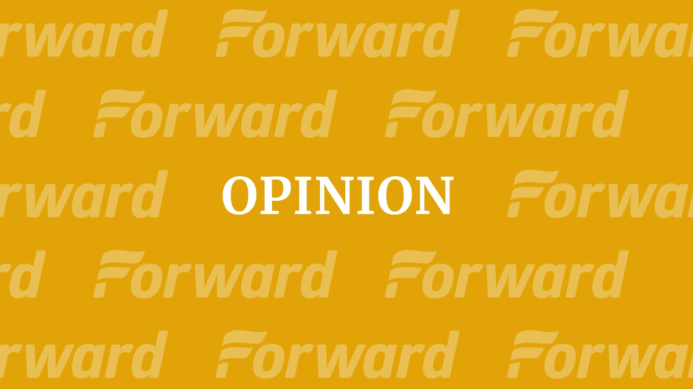
A Forward for the Inquisitive Reader
Graphic by Angelie Zaslavsky

Writer-at-Large Jane Eisner April 19, 2015
As I cross the country to visit synagogues, universities and community centers, I am often approached by someone with a wistful smile and a similar story: “I remember when my grandfather would give me a nickel to run down to the corner store and buy the Jewish Forward.”
How could I not be moved by these memories? I’ve been a journalist for decades, and no other publication I have worked for evokes this deep, warm emotional connection with its readers. In a media landscape where new sites emerge and disappear constantly, I recognize how unusual it is for readers to relate to a single publication as if it were family.
But to be honest, I also get frustrated at this fuzzy evocation of the past. I want to say, “Thank you, I’m grateful, but please — hold on to who we were then, but take a look at what we are now!”
As American Jews have evolved in the 118 years since this newspaper was founded, so has their Forward. The proof is right before you.
The dramatic redesign of our newspaper and website is a bold statement about the Forward’s future, reflecting, as our publisher, Samuel Norich, wrote recently, “a fundamental shift in our understanding of how the American Jewish story is unfolding and how you — our readers, advertisers and donors — use and interact with media now.”
The new Forward in print is for those who still love to touch what we read, who delight in the serendipity of the turned page, who want to hold on to a special story or photograph for weeks or years. I count myself as one of those readers, and I am proud of the solid commitment to print that this redesign represents.
But the new Forward is also for those who experience journalism digitally, who read and post and share, who watch and listen, who access stories from wherever we are. I count myself as one of those readers, too. I remember, as a very young reporter, filing copy on a Teletype machine, but I’m not nostalgic for those days — the reach and potential of digital journalism, especially for a niche publication like ours, is thrilling and ennobling.
Our new website reflects what we think the newspaper of the future online should be: a beautifully designed, well-edited and easily navigated showcase for the best of our journalism. We are using new fonts — headlines are set in Prelo Slab and the body type is set in Freight Sans Pro — to improve readability. The overall look is clean and elegant, with a focus on storytelling and reader engagement.
Our sections are streamlined into news, culture and opinion, each with its own home page and navigation bar for easy use. Uncluttered, stories and videos on our new site are presented to entice you, the reader, to linger, dive deep and enjoy the experience. The entire website is responsive, built to be read on everything from a large desktop monitor to the sleekest smartphone.
You’ll notice a change in our color scheme. As much as we respect the traditional blue that anchored the Forward for years and seems to color just about every Jewish organization, we opted for a different statement. Gold is the emblem of excellence dating back to biblical times. And America was the goldene medina for the founders of the Forward — the golden land of promise, opportunity and acceptance.
Our logo also represents a dramatic new look, with the opening F designed as a gesture to our Yiddish past, and the forward tilt emblematic of an eagerness to embrace the future that is rooted in our name. (For the font geeks, it’s set in Glober, in italics.)
There are new features, too. , edited by Maia Efrem, will visit a different Jewish household across the country each week for an intimate window into how contemporary Jews live, eat and organize ourselves. The Culture section host a personal essay edited by Anna Goldenberg, providing a narrative insight into the ordinary struggles, surprises and sublime pleasures of being Jewish today. Our new debate page for features like The Seesaw, the advice column on interfaith relationships, will now be able to host a multiplicity of voices and opinions on a single topic.
Throughout the site, we will continue to publish the very best in Jewish journalism — elegantly written long-form narratives, impactful investigations, hard-hitting editorials, provocative opinion columns, culture criticism that is elevating and incisive, and feature stories that will grab your heart.
This redesign process has been more intense than any of us expected, involving nearly everyone who works here. I want to pay tribute to our publisher, board and association members, who have supported us with the necessary time and resources — not a trivial undertaking for a small not-for-profit organization like the Forward.
Although this has been a grand communal effort, I do want to honor two people with special thanks. Kurt Hoffman, the art director, who has worked at the Forward longer than just about anyone, single-handedly redesigned the print edition with exceptional understanding and elegance, and his design aesthetic is found throughout the website, too.
And Dan Friedman, the managing editor, heroically agreed to be the project manager for this long endeavor, displaying uncommon attention to detail, and patience in balancing a zillion tasks, personalities and ideas.
For me, this redesign process has been much more challenging than a simple cosmetic change. It grew out of a microscopic, sometimes uncomfortable, dissection of the Forward’s weaknesses and its strengths, leading to a distillation of our character and mission.
In the end, we realized that what motivates us, what sets us apart from our competitors, what has driven this news organization from the 19th century into the 21st, what will keep us relevant for new generations of Jews, is our inquisitive soul. As journalists and as Jews, we are inquisitive by nature — probing, skeptical, independent, unafraid, devoted to our community’s core values, and eager to engage with each other and the complicated, amazing world around us. We ask questions.
We ask why.
Read more about how to navigate our new website here.
Below read some of the rationale for redesigning our beautiful new compact, luxury print edition. (and you can subscribe to it here.)

Did you know that only 2% of Forward readers donate to support our nonprofit newsroom? That 2% make it possible for millions to read the Forward without a paywall or subscription — removing any barriers to the full and fair Jewish story.
But while the Forward is free to read, it isn’t free to produce. Big stories — like deep dives into the antisemitism data, political scoops or reporting trips to college campuses — take months of research and fact-checking. All while we keep you informed of what you need to know each day.
— Rachel Fishman Feddersen, Forward Publisher & CEO
Support our mission to tell the Jewish story fully and fairly.